Are your presentations falling flat? Do your slides feel cluttered, uninspired, and fail to capture your audience's attention? You're not alone. Many professionals and students struggle to translate their brilliant ideas into compelling visual narratives. The good news is that mastering presentation design isn't an innate talent; it's a skill you can learn. By focusing on fundamental graphic design principles, you can transform your slides from mere text dumps into engaging visual aids that truly resonate with your audience.
Key Takeaways
- 1Master presentation design with expert YouTube video curation.
- 2Learn core graphic design principles for impactful slides.
- 3Discover visual storytelling and slide creation techniques.
- 4Apply actionable tips to elevate your presentations.
- 5Achieve clear, engaging, and memorable visual communication.
Who this is for
- If you're struggling to make your slides visually appealing
- If you're a professional, student, or educator needing to present information effectively
- If you're looking for practical, video-based guidance on presentation design
Start Learning with AI-Powered Video Summaries
Get instant summaries, ask questions, and turn any video into an interactive study session.
Try Querivo Free →Build a Strong Foundation: Mastering Graphic Design's Core Principles
When crafting presentations, we often get so caught up in the content that the visual aspect takes a backseat. But here's the thing: effective visual communication isn't magic, it's built on solid design principles. This video provides a comprehensive overview of the essential design principles in a concise and easily digestible format, making complex concepts accessible even for beginners. You'll learn how to effectively use Emphasis to draw attention to key elements, Contrast to differentiate between components, and Repetition to create a sense of unity and brand consistency. Understanding concepts like Movement, Proportion, Balance, and Alignment is like learning your ABCs for design – they form the bedrock of anything visually appealing and understandable. The creator also hints at practical application within Canva, offering a direct pathway to implement these learnings. Seriously, getting these fundamentals right makes everything else fall into place.
- Grasp essential graphic design principles for better visuals.
- Learn how to apply emphasis, contrast, and white space effectively.
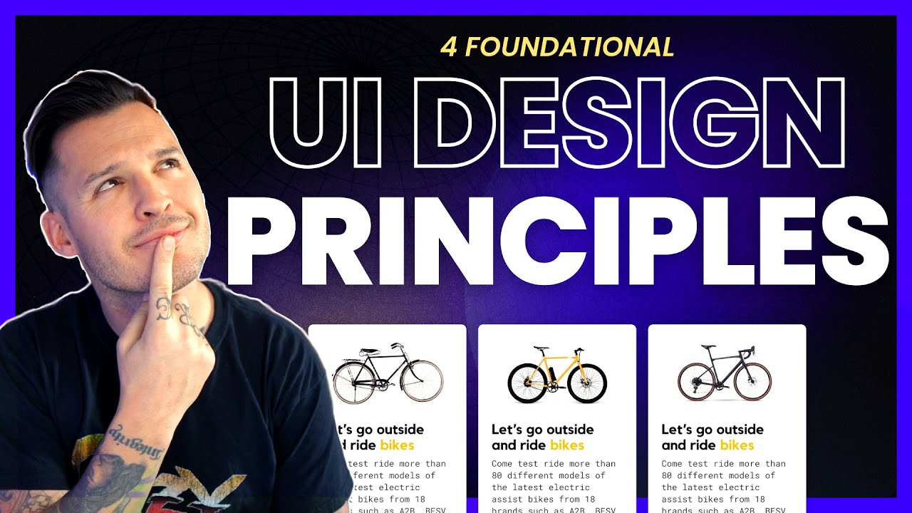
Design Like a Pro: Elevating Your PowerPoint Slides
You've got the content, but how do you make it pop on screen? This video is your guide to applying core graphic design techniques specifically for business presentations, using tools like PowerPoint. It's all about creating slides that are not just informative, but genuinely impactful. The creator demystifies design principles by applying them to everyday objects and business contexts, making complex concepts accessible and demonstrating their practical relevance for creating impactful presentations. You'll learn how to establish a clear Hierarchy so your audience knows exactly what to focus on, and how crucial Space (yes, white space!) is for avoiding that cluttered, overwhelming look. Proper Alignment makes your slides look polished and professional, while Repetition builds consistency. And Contrast? It's your best friend for highlighting what truly matters. This is essential viewing for anyone who wants their slides to be as effective as their message.
- Apply hierarchy, space, alignment, repetition, and contrast to slides.
- Create professional and understandable business presentations.
Study This Video Deeper
Get an AI summary and ask questions about confusing parts in real-time.
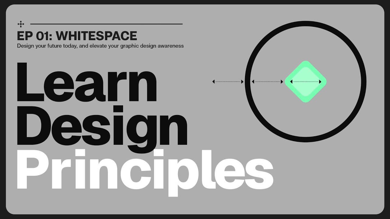
Open in Querivo →The Art of Breathing Room: Unlock the Power of White Space
Think white space is just empty background? Think again! This video dives deep into one of the most powerful, yet often underestimated, design principles: white space. You'll learn how strategically using "empty" areas can dramatically improve clarity, boost emotional impact, and make your entire design look and feel so much better. It's not just about filling up a slide; it's about giving your content room to breathe. The creator uniquely blends theoretical insights with practical examples, emphasizing emotional impact, which is often overlooked in design education. They explain how white space actively guides your audience's eye, distinguishing between micro and macro applications for nuanced design. You might be surprised by the psychological impact of ample white space and how to use it for dynamic balance. Mastering this one principle alone can transform your presentation design.
- Understand the crucial role of white space in design.
- Learn to use white space for clarity, impact, and balance.
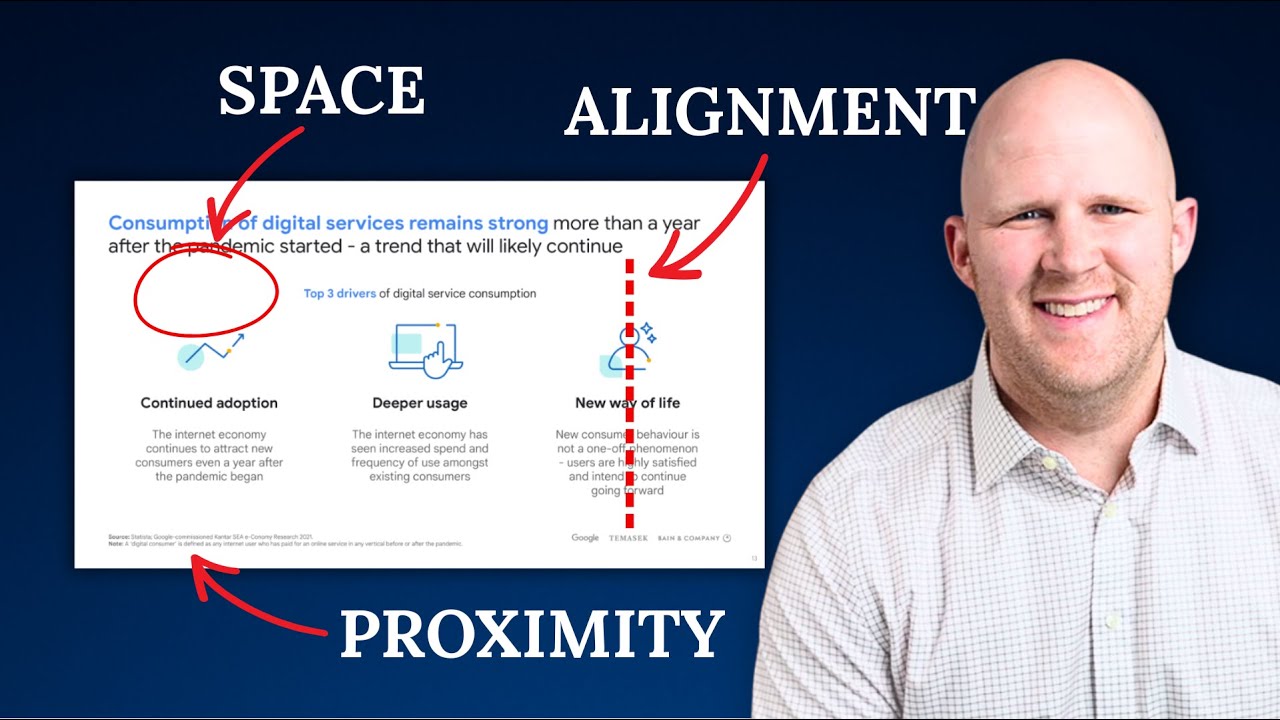
The C.R.A.P. Method: Four Pillars for Highly Effective Design
Sometimes, the simplest acronyms are the most memorable. This video introduces the C.R.A.P. method – Contrast, Repetition, Alignment, and Proximity – a super actionable framework for creating incredibly effective designs, whether for UI or presentations. Forget complex jargon; these four pillars are your go-to for organizing information, building visual interest, and making sure your message lands. The creator uses a memorable and slightly provocative acronym (C.R.A.P.) to help viewers retain the core design principles, combined with clear visual examples showing the 'before' and 'after' impact of applying these techniques. You'll see exactly how applying Contrast makes elements stand out, how Repetition creates a cohesive feel, how Alignment brings order, and how Proximity groups related ideas logically. It’s a game-changer for moving your designs from "meh" to "wow."
- Learn the C.R.A.P. (Contrast, Repetition, Alignment, Proximity) framework.
- Organize information and enhance visual appeal using these principles.
Your Next Steps
Ready to make your presentations unforgettable? By understanding and applying the core principles covered in these videos – emphasis, contrast, white space, hierarchy, alignment, repetition, and proximity – you're well on your way to creating slides that are not only visually stunning but also highly effective at conveying your message. These YouTube resources offer practical, actionable insights that you can start using right away. Don't let your content get lost in poor design; invest a little time in these foundational skills and watch your presentations come to life.
Your Action Items
- ☐Pick one video from above and watch it on Querivo
- ☐Ask questions and check summaries while watching without breaking your flow
- ☐Use the AI chat to clarify confusing parts and deepen understanding
- ☐Come back for more curated videos on topics you want to master
Transforming your presentation design is entirely within reach. Watch these videos, practice the techniques, and you'll definitely see a difference in how your audience engages with your content.
Turn Any YouTube Video into an Interactive Lesson
Paste any video link, get an instant AI summary, and ask questions in real-time.
Try Querivo Free →