Are you drowning in spreadsheets but struggling to extract meaningful insights? Excel Pivot Tables are your secret weapon for transforming raw data into actionable intelligence, and learning to wield them effectively can revolutionize your data analysis process.
Key Takeaways
- 1Your ultimate guide to mastering Excel Pivot Tables on YouTube.
- 2Learn to build, analyze, and report with dynamic data visualizations.
- 3Master calculated fields for custom metrics and advanced insights.
- 4Streamline data management for complex datasets.
- 5Transform raw data into impactful business decisions.
Who this is for
- If you're a data analyst overwhelmed by spreadsheet volumes
- If you're a business professional needing faster, clearer reporting
- If you're a student looking to boost your Excel proficiency
Start Learning with AI-Powered Video Summaries
Get instant summaries, ask questions, and turn any video into an interactive study session.
Try Querivo Free →Master the Fundamentals: Building Your First Pivot Table with Ease
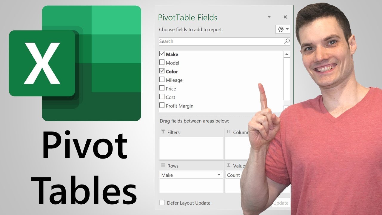
Feeling lost in a sea of data? This video is your perfect starting point for understanding the magic of Excel Pivot Tables. It breaks down exactly why you'd want to use them in the first place – think summarizing massive datasets without breaking a sweat. You'll learn the practical steps to create your very first Pivot Table, demystifying the process and making it feel surprisingly achievable.
We found this tutorial especially helpful because it doesn't just show you how to click buttons; it explains the purpose behind each step. You'll get a solid grasp on what the Rows, Columns, and Values fields actually do, which is crucial for organizing your data effectively. Plus, it touches on grouping and drilling down, giving you a taste of the deeper analysis possible right from the start. Seriously, if you're new to Pivot Tables, this is where we recommend you begin.

- Get a clear understanding of Pivot Table basics.
- Follow step-by-step instructions to build your first table.
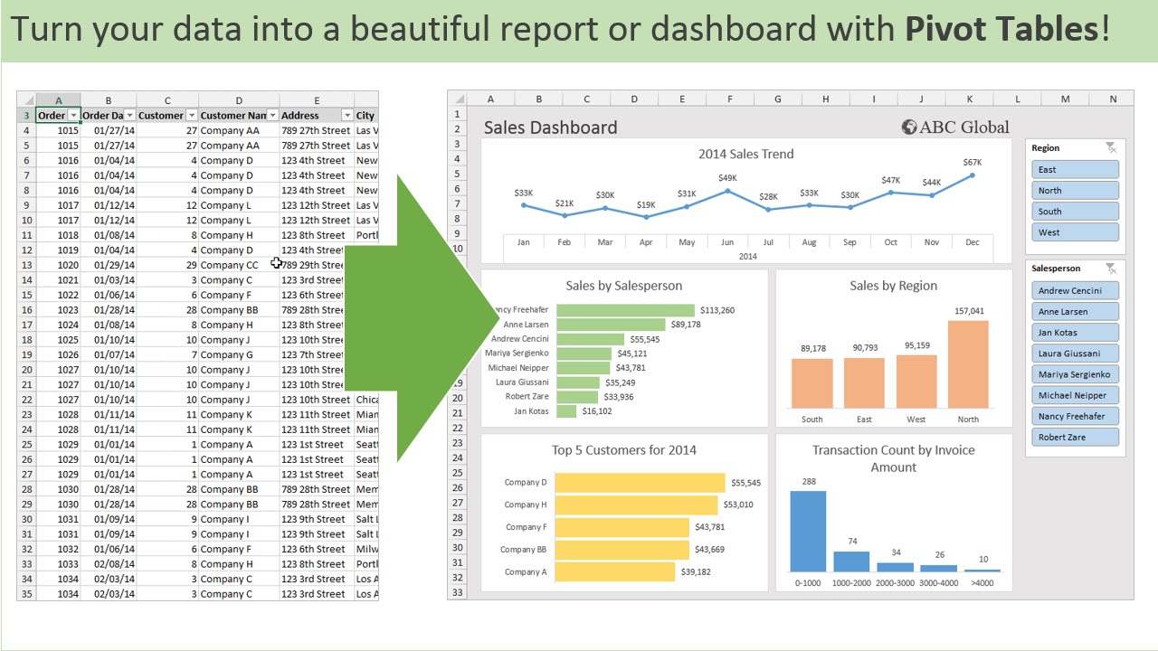
Unlock Advanced Reporting: Creating Dynamic Dashboards with Pivot Tables
Ready to move beyond basic summaries? This video dives into making your Pivot Tables truly interactive and visually compelling. You'll discover how to wield Slicers and Timelines, which are absolute game-changers for filtering your data on the fly. Imagine being able to slice and dice your reports with just a click – that's the power this tutorial unlocks.
What impressed us here is the focus on presentation. Creating dynamic dashboards isn't just about crunching numbers; it's about communicating insights effectively. This resource shows you how to pair your Pivot Tables with Pivot Charts, turning complex data into easy-to-understand visuals. You'll also learn valuable techniques like grouping data by dates and creating custom metrics, which are essential for robust business intelligence reporting. It’s a really solid guide for anyone looking to elevate their Excel reporting game.

- Make your reports interactive with Slicers and Timelines.
- Learn to create impactful Pivot Charts to visualize data.
Study This Video Deeper
Get an AI summary and ask questions about confusing parts in real-time.
Open in Querivo →Elevate Your Analysis: Mastering Calculated Fields and PivotTable Options
Sometimes, the data you need isn't directly in your spreadsheet. That's where calculated fields come in, and this video is your go-to resource for mastering them. You'll learn precisely how to create custom metrics and formulas within your Pivot Tables, enabling you to perform more complex analysis and derive unique insights that spreadsheets alone can't easily provide. It’s definitely a skill that sets you apart.
We also appreciated the deep dive into Value Field Settings. Understanding how to properly aggregate and summarize your data – whether it's summing, averaging, or counting – is fundamental. Plus, the creator touches on advanced formatting and layout options, which are surprisingly important for making your reports clear and professional. This tutorial also covers managing your data sources, ensuring you can refresh your Pivot Tables efficiently as your data changes. It’s a surprisingly insightful look at the finer details that make a big difference.

- Create custom metrics using calculated fields.
- Master value field settings for precise data aggregation.
Streamline Your Workflow: Efficient Data Management with Pivot Tables
Working with large or messy datasets? This video offers practical strategies to make your data analysis workflow much smoother. It focuses on preparing and cleaning your data before you even create a Pivot Table, which is a crucial step often overlooked. You'll learn techniques to handle different data types and potential errors that can pop up, saving you a lot of frustration down the line.
What’s particularly useful here are the tips for managing multiple Pivot Tables from a single data source. This can be a real time-saver when you need different views or summaries of the same information. The creator shares best practices for organizing and naming your Pivot Tables, too, which might sound minor, but trust us, it makes a huge difference when you're managing a complex workbook. This is a must-watch for anyone who wants to be more efficient with their Excel data management.
- Learn essential data preparation techniques for Pivot Tables.
- Discover efficient ways to manage multiple Pivot Tables.
Your Next Steps
By leveraging the power of Excel Pivot Tables and the curated video resources highlighted in this article, you can significantly enhance your data analysis capabilities, turning raw data into compelling insights and driving better business decisions.
Your Action Items
- ☐Pick one video from above and watch it on Querivo
- ☐Ask questions and check summaries while watching without breaking your flow
- ☐Use the AI chat to clarify confusing parts and deepen understanding
- ☐Come back for more curated videos on topics you want to master
Turn Any YouTube Video into an Interactive Lesson
Paste any video link, get an instant AI summary, and ask questions in real-time.
Try Querivo Free →Related Videos You Might Enjoy
Looking for more perspectives on this topic? Here are some additional videos worth checking out:
Master Data Analysis on Excel in Just 10 Minutes

Master Pivot Tables in 10 Minutes (Using Real Examples)

Pivot Table Excel Tutorial
Pivot Tables in Excel | Excel Tutorials for Beginners
This video tutorial introduces beginners to pivot tables in Excel, a powerful tool for summarizing and analyzing data. It walks through creating a basic pivot table using a sales dataset, demonstrating how to group data by country and state and display revenue.