In today's digital landscape, a website that looks and functions flawlessly on a desktop monitor is just half the battle. The real victory lies in captivating users across every device, from the smallest smartphone to the largest tablet. Responsive web design isn't a luxury anymore; it's a necessity. Fortunately, the wealth of knowledge on YouTube can guide you through mastering this crucial skill.
Key Takeaways
- 1Your essential guide to responsive web design on YouTube.
- 2Learn advanced CSS for fluid and adaptive layouts.
- 3Master media queries for chameleon-like responsiveness.
- 4Understand CSS units for cross-device compatibility.
- 5Build websites that look great everywhere.
Who this is for
- If you're struggling to make your website look good on mobile devices
- If you're a beginner developer wanting to learn responsive design fundamentals
- If you're an intermediate developer looking to level up your CSS skills for adaptability
Start Learning with AI-Powered Video Summaries
Get instant summaries, ask questions, and turn any video into an interactive study session.
Try Querivo Free →Elevate Your Responsiveness with Advanced CSS Techniques
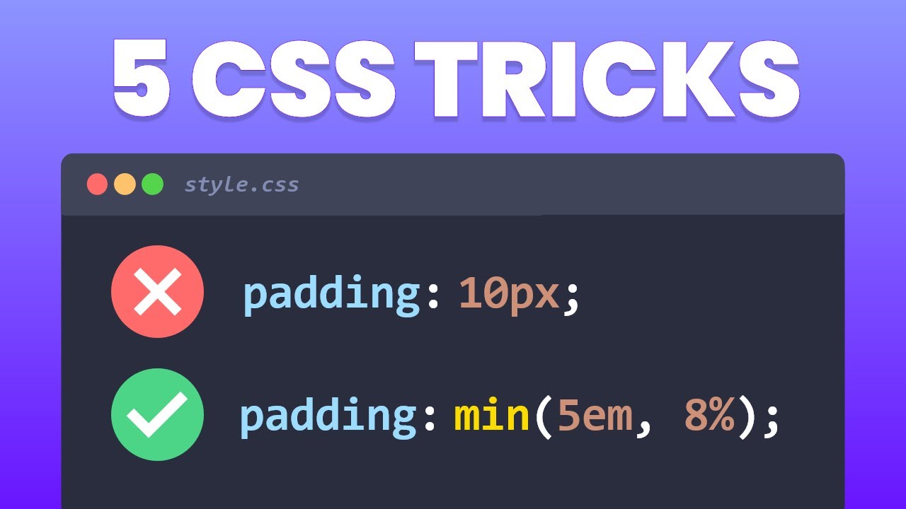
Sure, Flexbox and Grid are pretty solid for responsive web design, but what if you want to go a step further and implement truly elegant solutions? This video dives into some genuinely clever, CSS-only techniques that can make your layouts even more fluid and your designs more robust across all screen sizes. You'll discover often-overlooked, advanced CSS strategies that provide sophisticated solutions to common responsive design challenges, potentially avoiding more complex code or extensive media queries. It offers modern CSS solutions that simplify the development process, focusing on making things look and feel right no matter what device your user is on. We're talking about using modern CSS features that simplify development and lead to surprisingly good results. You'll learn how to implement these advanced methods that will definitely make your responsive web design efforts stand out and create a more seamless user experience.
- Unlock advanced CSS for truly fluid layouts.
- Implement modern techniques beyond basic Flexbox/Grid.
Build Responsive Websites with Ease: The Box Model Approach
Sometimes, the simplest approach is the most effective, right? This tutorial simplifies the often daunting topic of responsive design by focusing on foundational concepts like the box model and providing clear comparisons between flexbox and grid, along with a practical planning methodology. It's a fantastic way to start thinking about how elements interact and arrange themselves, making the process much less intimidating. You'll learn to view your website structure as nested boxes, which really helps in planning and building flexible arrangements. The creator walks you through practical applications, especially with Flexbox, showing you how to create dynamic and structured layouts that adapt gracefully. This video is pretty much a game-changer for anyone finding responsive design a bit overwhelming, providing a clear pathway by emphasizing core CSS display properties and the intuitive box model.
- Simplify responsive design with the box model concept.
- Master CSS display properties for structured layouts.
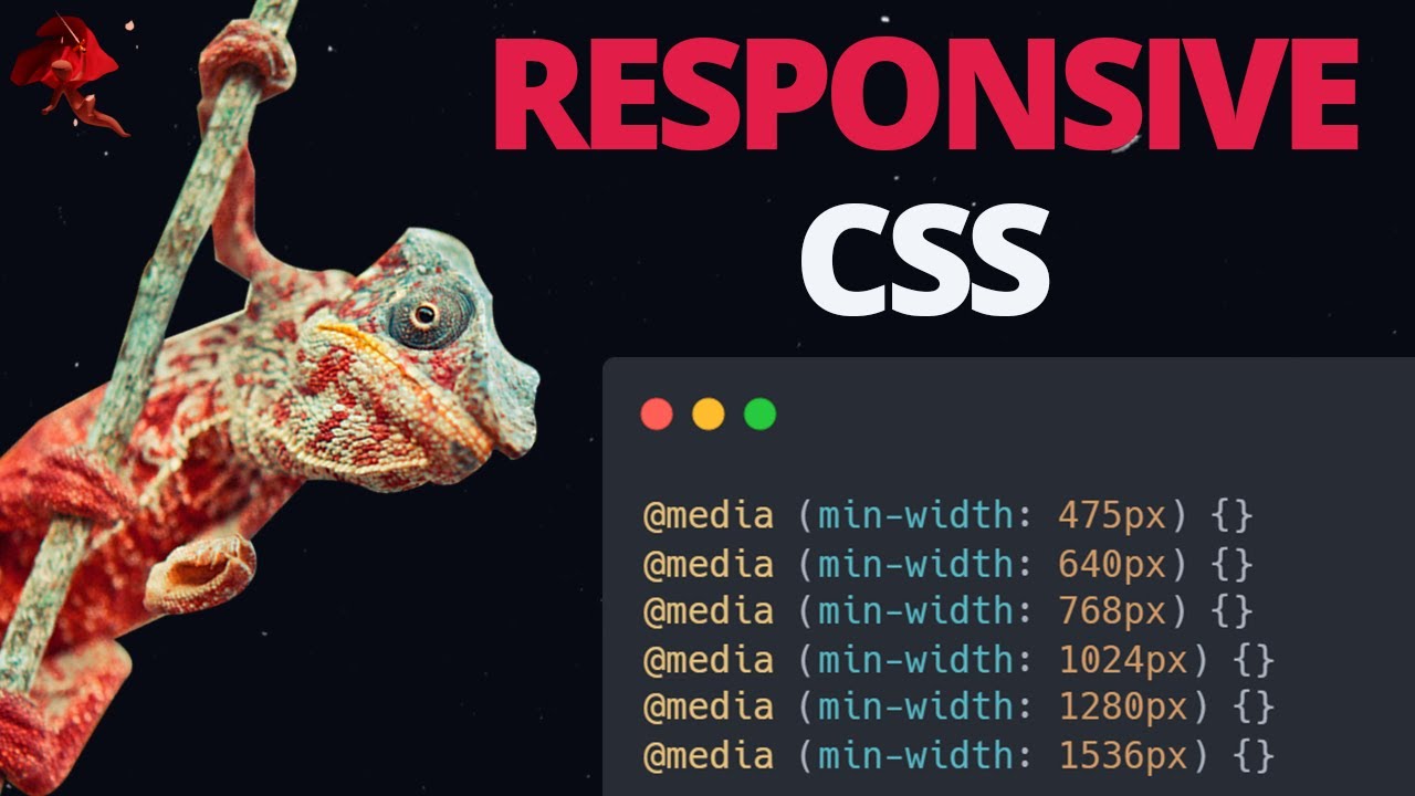
Master Media Queries for Chameleon-Like Responsiveness
Media queries are the backbone of responsive web design, and this video makes them super accessible while also offering strategic insights. You'll get a clear understanding of how they work, including contrasting two distinct approaches to responsive design: fixing components as they break versus using predefined breakpoints. This offers a more strategic and efficient way to build responsive websites. The creator uses the analogy of a chameleon, which is pretty fitting for how your website should adapt to different environments. You'll see how to implement responsive design using predefined breakpoints and utility classes, making your development workflow much smoother and more adaptable. It's a really practical guide for anyone wanting to nail down responsive CSS and move beyond reactive fixes to proactive design.
- Grasp the core concepts of media queries effectively.
- Learn efficient strategies for adaptive layout implementation.
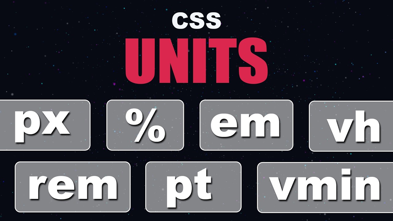
Unlock Fluid Layouts with Essential CSS Units
Understanding CSS units is absolutely key to building websites that behave well across all devices. This tutorial provides clear, practical demonstrations of how different CSS units behave in real-time, especially highlighting the benefits of relative units for responsive design by contrasting them with fixed pixel values. It’s surprising how much of a difference understanding this can make. You’ll differentiate between absolute units like pixels (px) and various relative units such as percentages (%), ems, rems, and the dynamic viewport units (vw, vh). The video demonstrates their practical application in a beginner-friendly manner, showing you exactly how they contribute to scalable typography and dynamic sizing. Seriously, if you're building for different screen sizes, grasping these fundamental CSS units is non-negotiable for creating truly adaptable and accessible web experiences.
- Differentiate absolute and relative CSS units.
- Utilize viewport and font-relative units for dynamic sizing.
Your Next Steps
By delving into these curated responsive web design YouTube tutorials, you're building a strong foundation and an advanced toolkit for creating truly adaptable websites. Understanding the nuances of CSS units, mastering media query strategies, and leveraging foundational concepts like the box model are all critical steps. Remember, responsive design is an ongoing journey, and mastering these techniques will ensure your creations connect with your audience, no matter how they choose to view them. This isn't just about making your site fit; it's about making it flourish on every screen.
Your Action Items
- ☐Pick one video from above and watch it on Querivo
- ☐Ask questions and check summaries while watching without breaking your flow
- ☐Use the AI chat to clarify confusing parts and deepen understanding
- ☐Come back for more curated videos on topics you want to master
These resources offer a fantastic pathway to building websites that don't just function, but truly excel on every screen. Keep practicing and experimenting!
Turn Any YouTube Video into an Interactive Lesson
Paste any video link, get an instant AI summary, and ask questions in real-time.
Try Querivo Free →Related Videos You Might Enjoy
Looking for more perspectives on this topic? Here are some additional videos worth checking out:
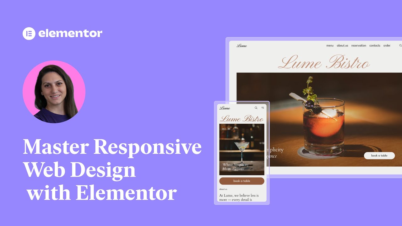
Master Responsive Web Design with Elementor: Essential Steps for a Seamless Experience
This video teaches viewers how to master responsive web design using Elementor, emphasizing its importance for user experience and SEO. It covers essential tools and techniques within Elementor to ensure websites look and perform flawlessly across all devices.
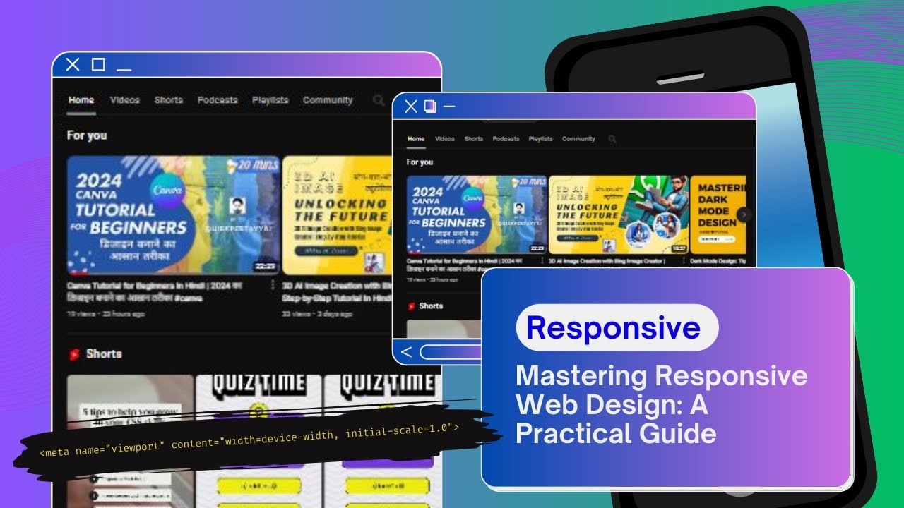
Mastering Responsive Web Design: A Practical Guide 💫
This video explains the fundamental principles of responsive web design, emphasizing its importance in creating websites that adapt seamlessly to various screen sizes and devices. It introduces key concepts like fluid layouts, flexible grids, and specific coding tools such as the viewport meta tag, CSS Grid, Flexbox, and media queries.
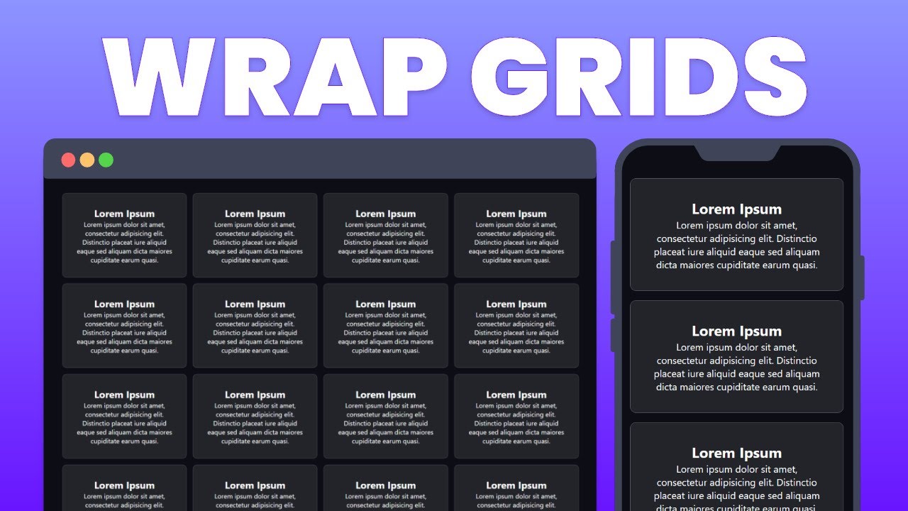
Create Responsive CSS Grid Layouts with GRID WRAPPING
This video teaches how to create responsive CSS Grid layouts that wrap and resize elements automatically on different screen sizes. It demonstrates using repeat(), auto-fit, minmax(), and fractions to achieve this, explaining why CSS Grid is superior to Flexbox for this specific purpose.