Tired of spreadsheets that look like a jumbled mess? Turn your raw data into stunning, insightful visuals that captivate your audience and drive better decisions.
Key Takeaways
- 1Master Excel charts for compelling data visuals.
- 2Transform raw data into actionable insights.
- 3Create interactive dashboards and dynamic reports.
- 4Enhance your presentation impact and clarity.
- 5Make data-driven decisions with confidence.
Who this is for
- If you're struggling to make your data understandable at a glance
- If you're looking to create more impactful business presentations
- If you're a beginner wanting to learn Excel charting quickly and effectively
Start Learning with AI-Powered Video Summaries
Get instant summaries, ask questions, and turn any video into an interactive study session.
Try Querivo Free →Build a Solid Data Foundation: Cleaning and Basic Visualization
Ever feel like your Excel data is just a giant block of numbers waiting to overwhelm your audience? This first video is your essential starting point. It tackles the often-dreaded but crucial steps of preparing your data, making sure it's clean and accurate before you even think about charts. You'll learn practical ways to transform messy data into something workable and discover how to calculate descriptive statistics—that's the fancy term for summarizing your data so you can actually understand what it's telling you. Plus, it touches on visualizing initial patterns with tools like Box and Whisker plots, which are surprisingly good at spotting those pesky outliers.
This tutorial is a real game-changer for anyone who feels intimidated by raw data. It shows you how to lay a strong foundation, which is pretty much the most important part of effective excel data visualization youtube tutorials. It’s the sort of practical advice that makes a huge difference. You'll even get a peek at adding geographic data, hinting at the richer insights you can unlock later. For beginners, this video condenses vital data analysis and initial visualization techniques into a super digestible format.

- **Clean your data first:** Accuracy is key for reliable visuals.
- **Summarize your data:** Use descriptive statistics to grasp key patterns.
Study This Video Deeper
Get an AI summary and ask questions about confusing parts in real-time.
Open in Querivo →Mastering Data Visualization Principles for Impactful Presentations
Once your data is prepped, it's time to make it sing. This video dives deep into the why behind good visualization, framing it not just as making pretty charts, but as powerful data storytelling. You’ll discover how to harness common Excel chart types like Bar, Pie, and Line charts to effectively communicate your findings. But it doesn't stop at the basics; this tutorial also introduces you to creating interactive dashboards. Imagine viewers being able to slice and dice the data themselves, exploring trends and proportions dynamically using Slicers and Filters!
This is where the magic happens for analysts and presenters. It shows you how to take that cleaned data and turn it into a narrative that genuinely aids decision-making. We're talking about leveraging Pivot Tables and Pivot Charts, which are surprisingly intuitive once you see them in action, to handle large datasets with ease. It’s a comprehensive guide that bridges the gap between raw numbers and compelling business visuals, a definite must-watch for anyone serious about excel data visualization youtube resources.
- **Data storytelling is key:** Make your visuals tell a compelling story.
- **Build interactive dashboards:** Empower users with Slicers and Filters.
Quickly Generate Essential Charts for Comparison, Trends, and Proportions
Sometimes, you just need to get a clear picture fast. This tutorial focuses on efficiently generating the most fundamental Excel chart types. It’s perfect for those moments when you need to quickly compare data across different categories using Bar Charts, track changes over time with Line Charts, or show how parts make up a whole with Pie Charts. You'll learn to create these essential visuals without a fuss, making them ideal for immediate communication.
What's really helpful here is the focus on speed and clarity. You don't need to be an Excel wizard to follow along. The instructor walks you through the process step-by-step, ensuring you understand how to select the right chart for your data and then how to make those basic customizations—like adding clear titles, adjusting colors, and labeling your data points—that make all the difference in how easily your audience grasps the information. It's a brilliant little video for anyone wanting to quickly learn excel charts graphs.
- **Use Bar charts for comparison:** Easily see differences between categories.
- **Utilize Line charts for trends:** Track changes and patterns over time.
- **Employ Pie charts for proportions:** Show parts of a whole effectively.
Streamline Chart Creation and Customization for Beginners
Feeling a bit daunted by the sheer number of options in Excel? This video is your friendly guide to making chart creation simple and accessible, even if you're just starting out. It emphasizes converting your raw data into proper Excel tables first, which honestly makes everything else so much smoother. You'll then explore Excel's "Recommended Charts" feature – a surprisingly clever tool that suggests the best chart types for your data, saving you a lot of guesswork.
The beauty of this tutorial lies in its practical, step-by-step approach to inserting, moving, resizing, and crucially, customizing charts. Learning to effectively label your axes and data points ensures your visualizations are crystal clear and professional. It demystifies the process, making it totally achievable for beginners to produce polished, informative charts. This is precisely the kind of resource you need when you're looking to learn excel charts graphs from the ground up.
- **Use Excel Tables:** Organize data for easier charting.
- **Leverage 'Recommended Charts':** Get quick, relevant visualization suggestions.
- **Customize chart elements:** Ensure clarity with titles, labels, and axes.
Your Next Steps
By mastering these Excel charting techniques, you can transform raw data into compelling visual narratives. From foundational data cleaning and basic chart creation to advanced dashboard design, Excel offers a powerful suite of tools to enhance your data analysis and presentation skills. These videos provide a clear roadmap to becoming proficient.
Your Action Items
- ☐Pick one video from above and watch it on Querivo
- ☐Ask questions and check summaries while watching without breaking your flow
- ☐Use the AI chat to clarify confusing parts and deepen understanding
- ☐Come back for more curated videos on topics you want to master
Ready to make your data speak volumes? This curated list of YouTube videos is your starting point for mastering excel data visualization.
Turn Any YouTube Video into an Interactive Lesson
Paste any video link, get an instant AI summary, and ask questions in real-time.
Try Querivo Free →Related Videos You Might Enjoy
Looking for more perspectives on this topic? Here are some additional videos worth checking out:
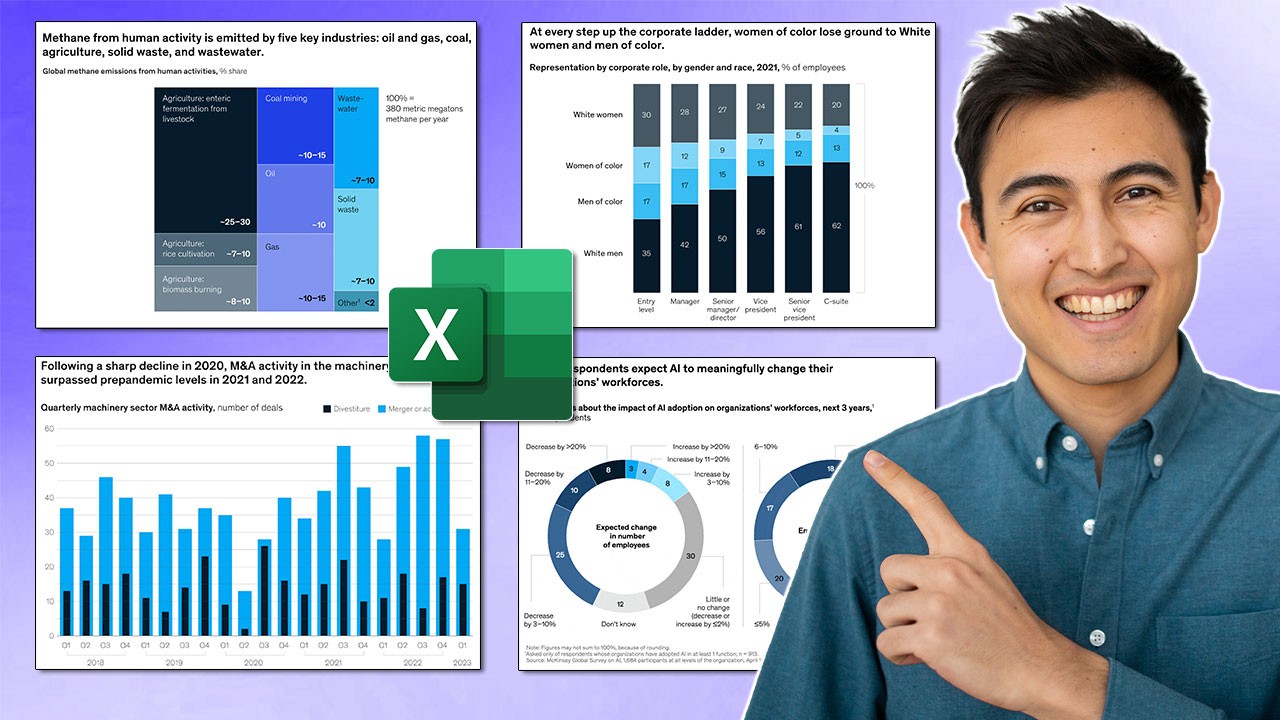
Make Impressive McKinsey Visuals in Excel!
This video tutorial demonstrates how to create two distinct, high-impact business visuals in Microsoft Excel, inspired by the professional style of McKinsey & Company. It covers building a radial bar chart and a nested bar chart, explaining data preparation, chart formatting, and aesthetic customization.
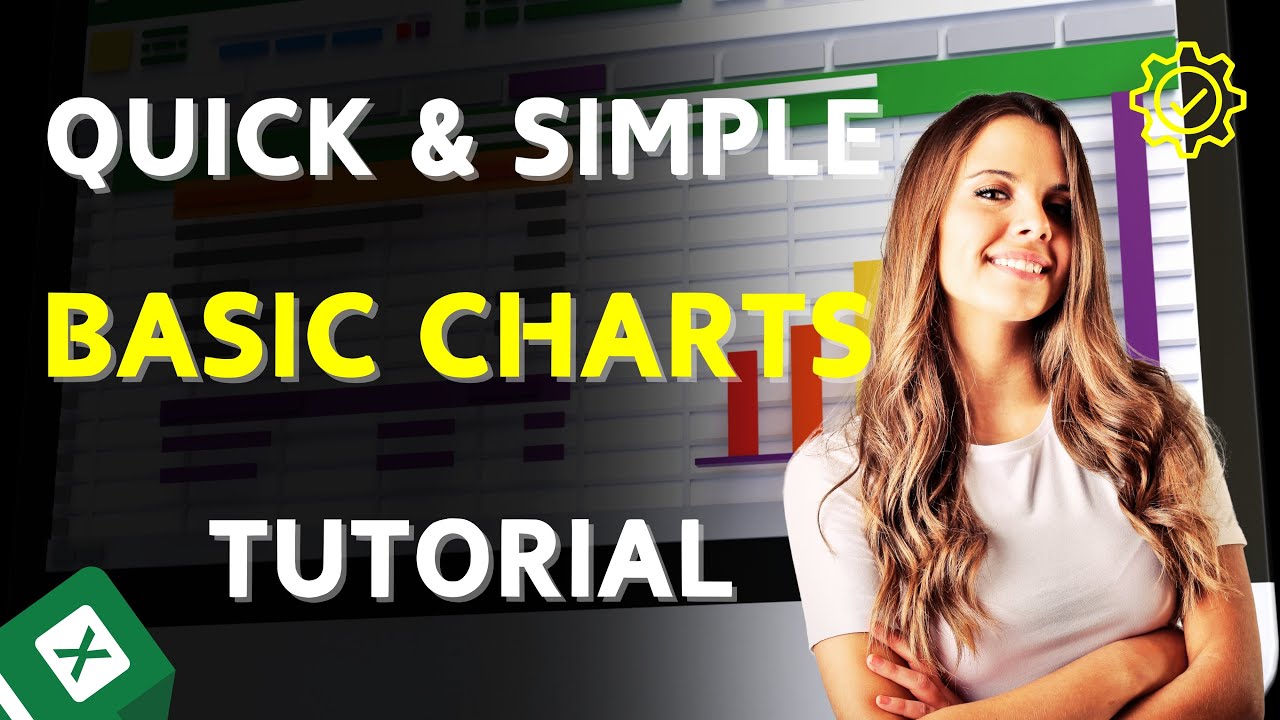
Excel Quick and Simple Charts Tutorial | Master Data Visualization | Sum Sprint
This tutorial provides a step-by-step guide on creating and customizing basic charts in Microsoft Excel. It covers converting data into tables, inserting recommended charts, moving and resizing charts, and customizing elements like titles, axis labels, data labels, and chart types.
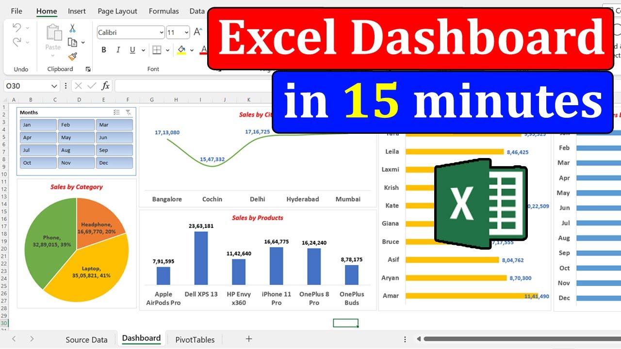
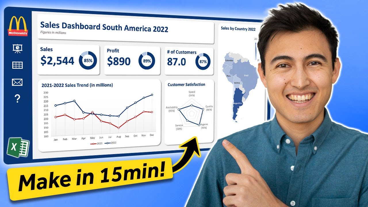
Make an Awesome Excel Dashboard in Just 15 Minutes
This video demonstrates how to build an interactive Excel sales dashboard for the South America region in under 15 minutes. It covers structuring the dashboard with dynamic navigation, creating various charts like radar, map, line, and donut charts, and customizing them for a professional look.
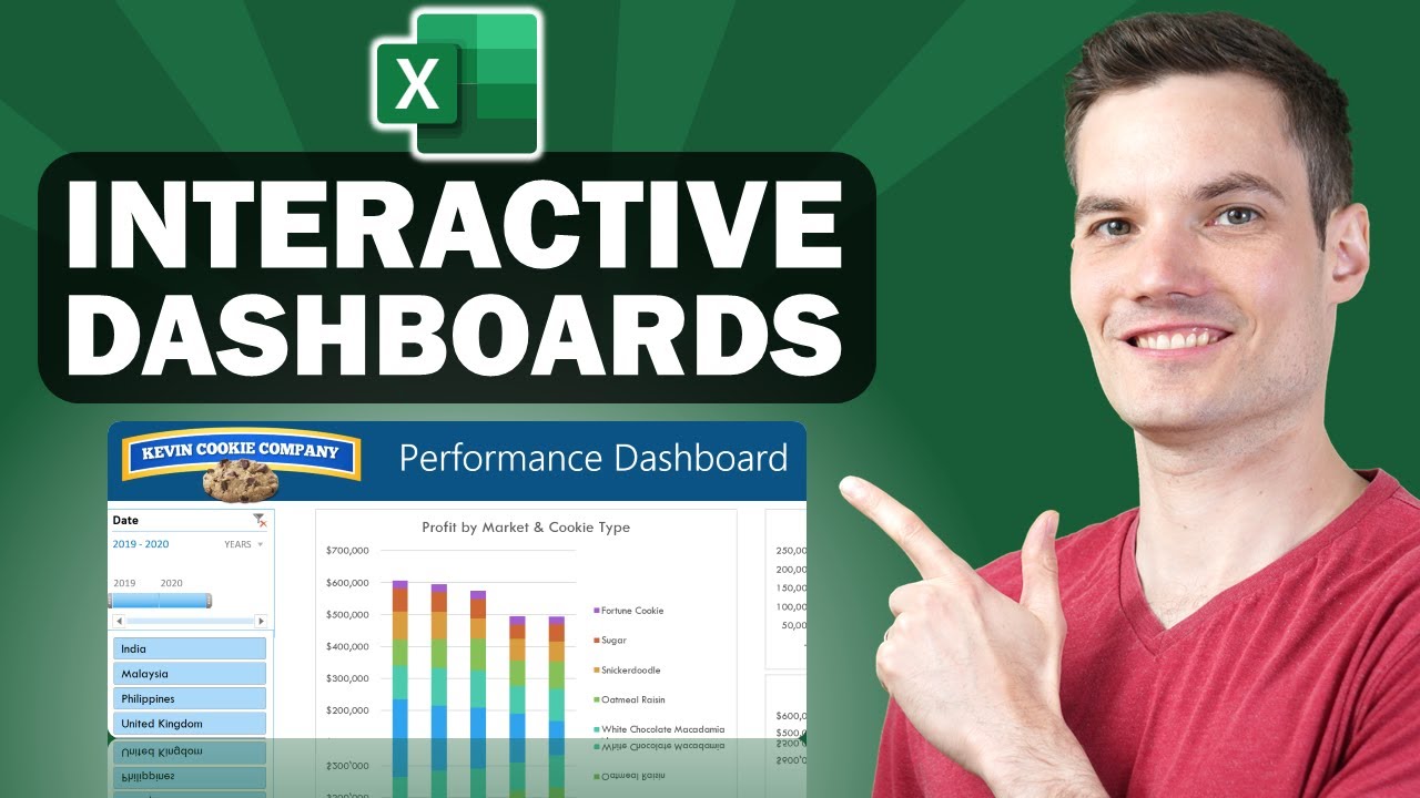
📊 How to Build Excel Interactive Dashboards
This video provides a step-by-step guide on how to build dynamic and interactive dashboards in Microsoft Excel without using VBA or add-ins. It demonstrates how to transform raw data into visually appealing charts and tables that automatically update with new information.
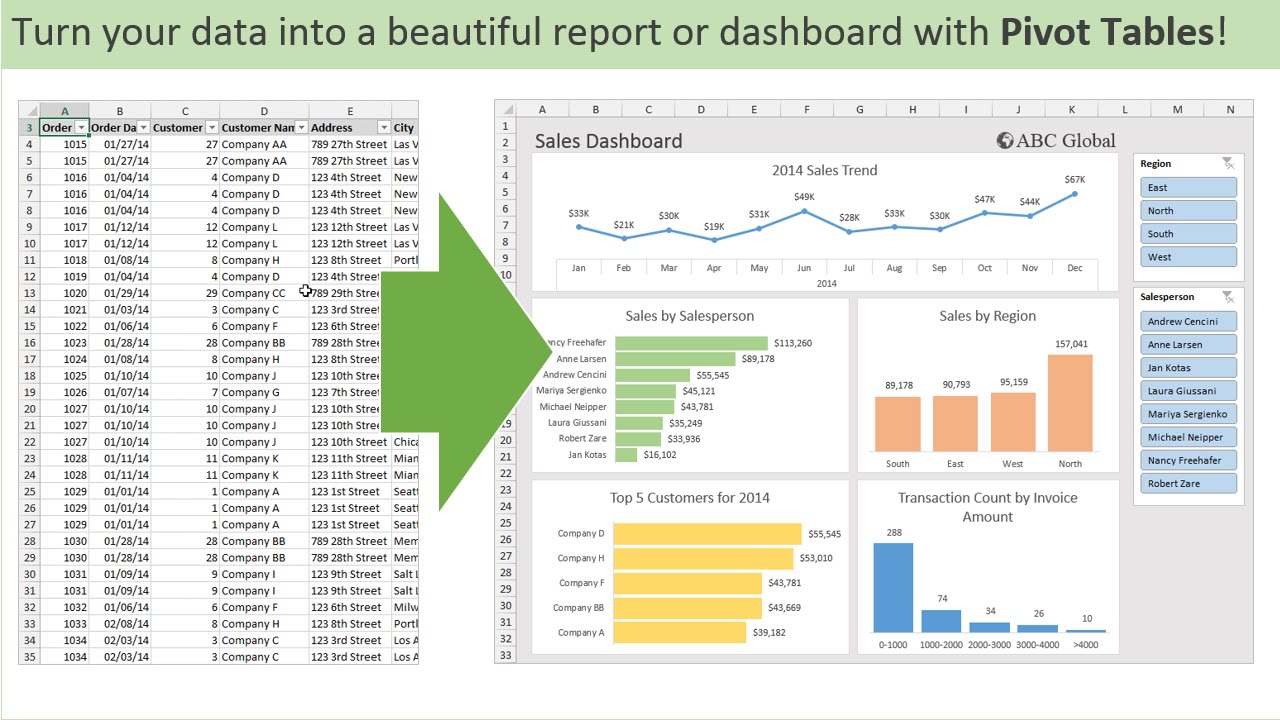
How to create a Simple Dashboard Report in Microsoft Excel
This video provides a step-by-step guide on how to create an interactive sales dashboard report in Microsoft Excel using pivot tables and charts. It demonstrates how to transform raw sales data into visualizations that allow for quick analysis of monthly sales, sales by representative, city, and product category, with the added functionality of filtering by month.