Feeling overwhelmed by numbers and charts? You're not alone! Understanding data is a crucial skill in today's world, and statistics is your key.
Key Takeaways
- 1Master the fundamentals of data interpretation with curated videos.
- 2Learn the core differences between descriptive and inferential stats.
- 3Grasp key measures like mean, median, mode, and standard deviation.
- 4Discover how to visually summarize and present your data effectively.
- 5Gain confidence in analyzing and understanding datasets.
Who this is for
- If you're a student struggling with your first stats course
- If you're a researcher needing to interpret study findings accurately
- If you're new to data analysis and want a clear starting point
Start Learning with AI-Powered Video Summaries
Get instant summaries, ask questions, and turn any video into an interactive study session.
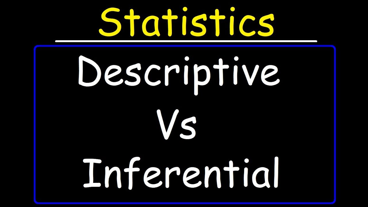
Try Querivo Free →Descriptive vs. Inferential Statistics: Laying the Groundwork
Navigating the world of statistics can feel a bit like exploring a new city. You need a map to understand where you are and where you can go. That's precisely what this first video offers: a foundational understanding of the two main roads statistics can take. You'll discover the fundamental distinction between descriptive and inferential statistics, which is absolutely crucial for choosing the right analytical approach for any given problem. It’s not just about knowing the terms; it’s about grasping their purpose.
Descriptive statistics, as the name suggests, is all about describing what your data looks like. Think of it as taking a snapshot. It involves organizing, summarizing, and presenting your data in a way that makes it understandable. This could be through simple averages or charts. On the other hand, inferential statistics takes a step further. It uses the data you have from a smaller sample to make predictions or draw conclusions about a much larger population. This is where you infer things. Understanding this core difference helps you frame your research questions and interpret your findings correctly from the outset. It's a pretty solid starting point for anyone diving into data.

- The key difference is summarizing current data versus making predictions about a larger group.
- Choose the right statistical branch based on your research goals.
Demystifying Descriptive Statistics: Your Data's Storyteller
Once you've grasped the broad categories, it's time to get hands-on with descriptive statistics itself. This isn't just about numbers; it's about helping your data tell its story. This video dives deep into how descriptive statistics works its magic, explaining its components and how it aids in understanding collected data without necessarily making broad population-wide inferences. It’s about painting a clear picture of what you've gathered.
You'll learn about measures of central tendency – the mean, median, and mode. These are your go-to tools for figuring out the "typical" value within your dataset. But data rarely just sits at a single typical point, right? That’s where measures of dispersion come in. Understanding variance, standard deviation, range, and the interquartile range (IQR) reveals the "spread" of your data. Are your numbers clustered together, or are they all over the place? Plus, the video touches on how frequency tables and charts can visually summarize your data, making complex information digestible at a glance. It’s surprisingly helpful for initial data exploration.
- Central Tendency (Mean, Median, Mode) describes the typical value.
- Dispersion (Variance, Std Dev, Range, IQR) shows how spread out your data is.
Study This Video Deeper
Get an AI summary and ask questions about confusing parts in real-time.
Open in Querivo →Mastering the Standard Deviation: Unpacking Data Spread
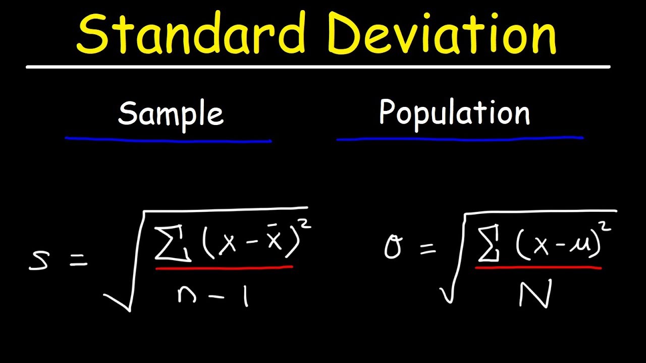
While understanding the "typical" value is important, how your data points deviate from that average is often where the real insights lie. Standard deviation is a particularly powerful measure for this, and this video hones in on it. It quantifies the typical distance of data points from the mean, offering a nuanced view of your data's variability. You'll definitely want to get comfortable with this concept.
This segment is really about unpacking how data points scatter around the average. You’ll get a look at the formulas for calculating both population and sample standard deviations, which is essential for accurate analysis. Why? Because knowing whether you're working with a whole group or just a sample impacts how you interpret the spread. By understanding and correctly interpreting standard deviation, you can effectively compare the variability of different datasets. This skill is invaluable when trying to make sense of diverse information. It’s a game-changer for understanding variation.
- Standard Deviation measures the typical spread of data from the mean.
- Learn the formulas and understand the difference between population and sample calculations.
Putting it All Together: Visualizing Your Data's Insights
Numbers and calculations are essential, but how do you actually show what your data means to others? That's where visualization comes in, and this video is all about making that happen. It focuses on how to represent descriptive statistics visually, making data interpretation not only easier for you but also more impactful when you communicate your findings. Visuals are often the quickest way to convey complex information.
You’ll explore charts like bar charts and pie charts, which offer incredibly quick visual summaries of your data's distribution. These are fundamental tools for any beginner. Beyond simple charts, the video also discusses frequency and contingency tables, providing structured overviews that highlight relationships and patterns within your data. Mastering effective visualization is absolutely key to communicating statistical findings clearly and persuasively. It’s not just about having the right numbers; it’s about telling the right story with them. This is where an Introduction to Statistics YouTube search really pays off.
- Visualizations like bar and pie charts provide quick data summaries.
- Tables help in presenting structured overviews and relationships.
Your Next Steps
You've taken your first steps into the world of statistics! By understanding descriptive versus inferential statistics and mastering key measures like central tendency and standard deviation, you're now equipped to start interpreting data more effectively. Visualizing your data further unlocks its narrative.
Your Action Items
- ☐Pick one video from above and watch it on Querivo
- ☐Ask questions and check summaries while watching without breaking your flow
- ☐Use the AI chat to clarify confusing parts and deepen understanding
- ☐Come back for more curated videos on topics you want to master
Ready to put your newfound knowledge into practice? Exploring more resources and starting to analyze your own datasets is the best way forward. Continue exploring introductory statistics topics, practice calculating these measures with real-world data, and consider delving into inferential statistics to make broader conclusions.
Turn Any YouTube Video into an Interactive Lesson
Paste any video link, get an instant AI summary, and ask questions in real-time.
Try Querivo Free →Related Videos You Might Enjoy
Looking for more perspectives on this topic? Here are some additional videos worth checking out:
Descriptive Statistics vs Inferential Statistics
This video tutorial introduces the two main branches of statistics: descriptive and inferential. Descriptive statistics focuses on organizing, summarizing, and presenting data using numbers and graphs, while inferential statistics uses sample data to draw conclusions and make predictions about a larger population, often incorporating probability and confidence intervals.
Descriptive Statistics [Simply explained]
This video provides a simple explanation of descriptive statistics, covering its purpose and four key components: measures of central tendency (mean, median, mode), measures of dispersion (variance, standard deviation, range, IQR), frequency tables, and charts. It emphasizes that descriptive statistics summarize collected data without inferring about the larger population.
![Descriptive Statistics [Simply explained]](https://img.youtube.com/vi/FzujIYo9GYo/maxresdefault.jpg)
Standard Deviation Formula, Statistics, Variance, Sample and Population Mean
This video explains the concept of standard deviation and demonstrates how to calculate both population and sample standard deviations using their respective formulas. It also covers how to determine variance and illustrates these concepts with practical examples, comparing data sets with different spread.