Struggling to create digital products that users actually want to use? The secret often lies in crafting interfaces that feel effortless, guiding users seamlessly through their journey.
Key Takeaways
- 1Discover top videos for Figma UI design mastery.
- 2Learn the psychology behind user-friendly interfaces.
- 3Master simplicity, navigation, and accessibility techniques.
- 4Get hands-on with essential Figma tools.
- 5Build intuitive digital experiences users will love.
Who this is for
- If you're a beginner looking to grasp UI design fundamentals.
- If you're an aspiring product designer wanting to refine your Figma skills.
- If you're a developer or manager needing to understand intuitive interface principles.
Start Learning with AI-Powered Video Summaries
Get instant summaries, ask questions, and turn any video into an interactive study session.
Try Querivo Free →Unlocking Intuitive Design: The Psychology Behind User Experience
Ever wondered why some apps just click while others leave you baffled? It often comes down to psychology. This video dives deep into the core principles that make an interface feel naturally intuitive. We're talking about understanding why users behave the way they do and how to leverage that knowledge to build better digital experiences.
You'll discover how things like simplicity, consistent feedback, and giving users control play a massive role in user satisfaction. Plus, it touches on the often-overlooked aspects of emotional design and empathy – making interfaces that connect on a more human level. It's a solid theoretical foundation before you even touch a design tool.
This video is a fantastic starting point for anyone new to UX or wanting to understand the "why" behind good design decisions. It's less about the nuts and bolts of Figma and more about the foundational thinking that drives successful UI. You'll definitely start seeing digital products a little differently after watching this.

- Understand the psychological drivers of intuitive interfaces.
- Apply core principles like simplicity, feedback, and control.
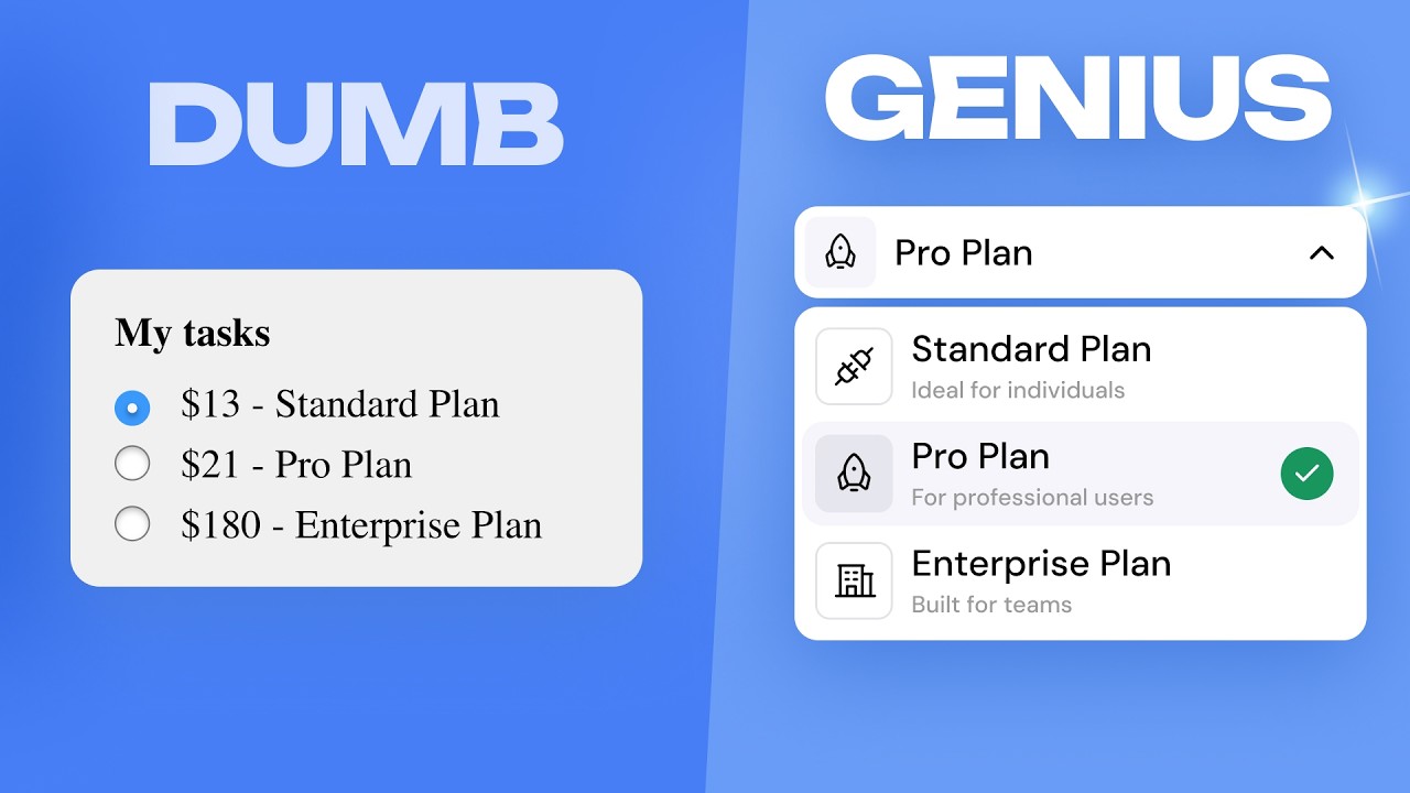
From Clutter to Clarity: Designing for Simplicity and Purpose
In the world of Figma UI design, less is usually more. Overcomplicating things is a surefire way to lose your users. This video really hones in on the practical side of making interfaces simple and purposeful. It's all about understanding who you're designing for and giving them exactly what they need, without overwhelming them.
You'll learn to spot the common pitfalls that lead to messy, confusing interfaces. Think about those forms that feel like an endless maze, or websites packed with so much information you don't know where to start. This video provides clear guidance on how to streamline processes and reduce user effort. It’s pretty essential stuff for anyone serious about creating usable products.
This is a must-watch for making your designs more user-friendly. It helps you cut through the noise and focus on what truly matters for the user's journey.
- Prioritize simplicity by tailoring information to specific users.
- Avoid common design mistakes that lead to complexity.
Beyond the Screen: Mastering Intuitive Navigation and Accessibility
Designing an interface that's easy to use means thinking beyond just the visual layout. How do users get around? Is it accessible to everyone? This video tackles these crucial questions head-on. It emphasizes truly understanding user needs and goals, which is the bedrock of any intuitive design.
You'll get a clear understanding of how to design for accessibility, ensuring that your interfaces are straightforward and navigable for all users, regardless of their abilities. Plus, it highlights the importance of mobile-first optimization and how to use user testing to continuously refine your designs. It’s about creating experiences that are not just functional but also inclusive and adaptable.
This resource is particularly helpful for ensuring your Figma UI design projects are robust and user-friendly across different platforms and for diverse audiences.

- Design with user needs and accessibility at the forefront.
- Optimize for mobile and use testing for continuous improvement.
Building Blocks of Intuition: Mastering Figma's Core UI Tools
Alright, so we've covered the psychology and principles. Now, let's get practical with Figma itself. This video is your entry point into using the tool for actual UI design. It breaks down the essential features you'll need to get started creating foundational design elements. If you're new to Figma, this is definitely where you'll want to begin.
You'll learn how to set up your workspace efficiently, getting your document preferences just right. Navigating the Figma interface might seem daunting at first, but this tutorial makes it confidence-building. And crucially, it introduces you to the basic shape tools and the fundamental concepts of fill and stroke. Mastering these basics is key to building anything more complex.
This is a hands-on tutorial that gets you comfortable with the core functionalities of Figma. Watching this will help you translate those design principles you've learned into tangible elements on your screen.
- Set up your Figma workspace and navigate the interface.
- Master basic shape tools, fill, and stroke concepts.
Your Next Steps
Crafting intuitive interfaces is a blend of understanding user psychology, prioritizing simplicity and clarity, and mastering the right design tools. By applying these principles, you can create digital experiences that are not only effective but also a joy to use.
Your Action Items
- ☐Pick one video from above and watch it on Querivo
- ☐Ask questions and check summaries while watching without breaking your flow
- ☐Use the AI chat to clarify confusing parts and deepen understanding
- ☐Come back for more curated videos on topics you want to master
Ready to put these insights into practice? Start designing your next intuitive interface in Figma today!
Turn Any YouTube Video into an Interactive Lesson
Paste any video link, get an instant AI summary, and ask questions in real-time.
Try Querivo Free →Explore the full range of tutorials in the 'Related Videos' section to deepen your understanding of spatial computing design and architectural principles that inform user experience.
Related Videos You Might Enjoy
Looking for more perspectives on this topic? Here are some additional videos worth checking out:
world's shortest UI/UX design course
How to think like a GENIUS UI/UX designer
Designing Intuitive & Accessible Spatial Experiences for VisionOS By Yulia Lápicus
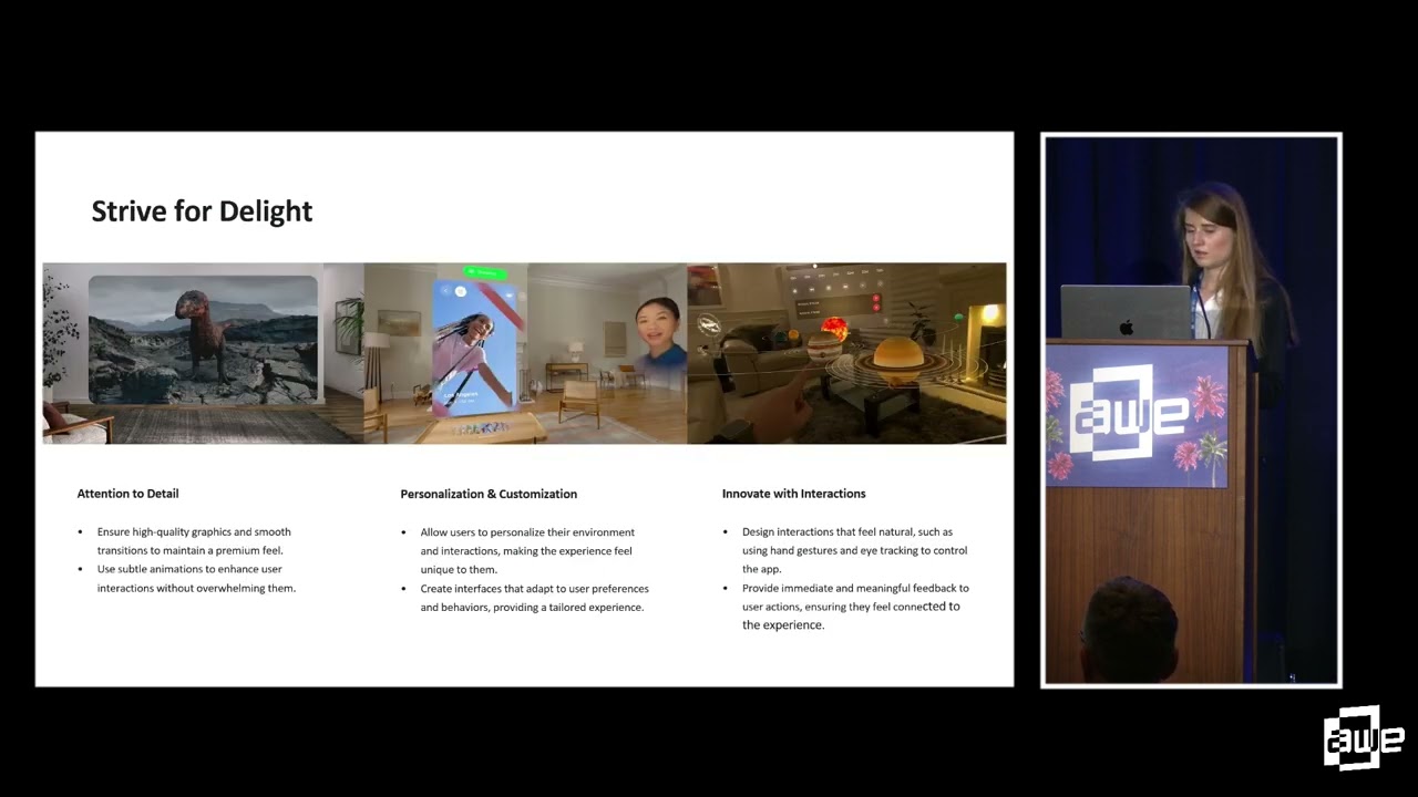
This video explores the fundamental principles of designing intuitive and accessible spatial experiences for Apple VisionOS. It covers the core elements of VisionOS design (Windows, Volumes, Spaces) and emphasizes creating intentional, immersive, comfortable, and delightful user experiences. The presentation also highlights the importance of accessibility for all users.
Intuitive interface
Fred Pilbrow discusses his firm's approach to architecture, highlighting a cultural project in Walthamstow and the sustainable design of tall buildings like the Edge building in London. He emphasizes the importance of context, public realm integration, and innovative sustainability features in modern architecture.