Tired of static spreadsheets that fail to tell your data's story? Unlock the power of dynamic visual reporting with the ultimate guide to Excel data visualization.
Key Takeaways
- 1Master Excel data visualization with curated YouTube tutorials.
- 2Learn to create interactive charts and dynamic dashboards.
- 3Transform raw data into compelling visual reports.
- 4Enhance business reporting with actionable insights.
- 5Elevate your data presentation skills with proven techniques.
Who this is for
- If you're struggling to make your data understandable and engaging
- If you're looking to create professional-looking reports without complex software
- If you're a data analyst, business professional, or student wanting to leverage Excel's visual power
Start Learning with AI-Powered Video Summaries
Get instant summaries, ask questions, and turn any video into an interactive study session.
Try Querivo Free →Dive Deep into Dynamic Data Exploration with Interactive Charts
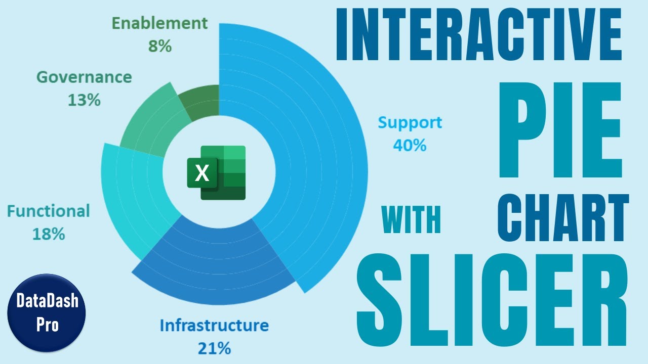
Ever feel like your pie charts are just… flat? This video, "Master Data Analysis on Excel in Just 10 Minutes," shows you how to inject life into your categorical data. We're talking about using PivotTables and slicers to build genuinely interactive pie and donut charts. Imagine being able to click on a region or a product category and see your chart instantly update, showing you exactly what you need to see. It’s a game-changer for exploring regional sales figures or product performance without getting lost in endless scrolling. The creator walks you through setting up PivotTables for smart summarization and then layers in slicers for that crucial interactive filtering. Plus, you'll learn how to make those charts look sharp, with clean data labels and proper handling of zero values, which is surprisingly important for clear reporting. It’s a quick, efficient way to seriously upgrade your Excel data visualization skills.

- Learn to create interactive pie/donut charts with PivotTables and slicers.
- Enhance data exploration by filtering dynamically.
Study This Video Deeper
Get an AI summary and ask questions about confusing parts in real-time.
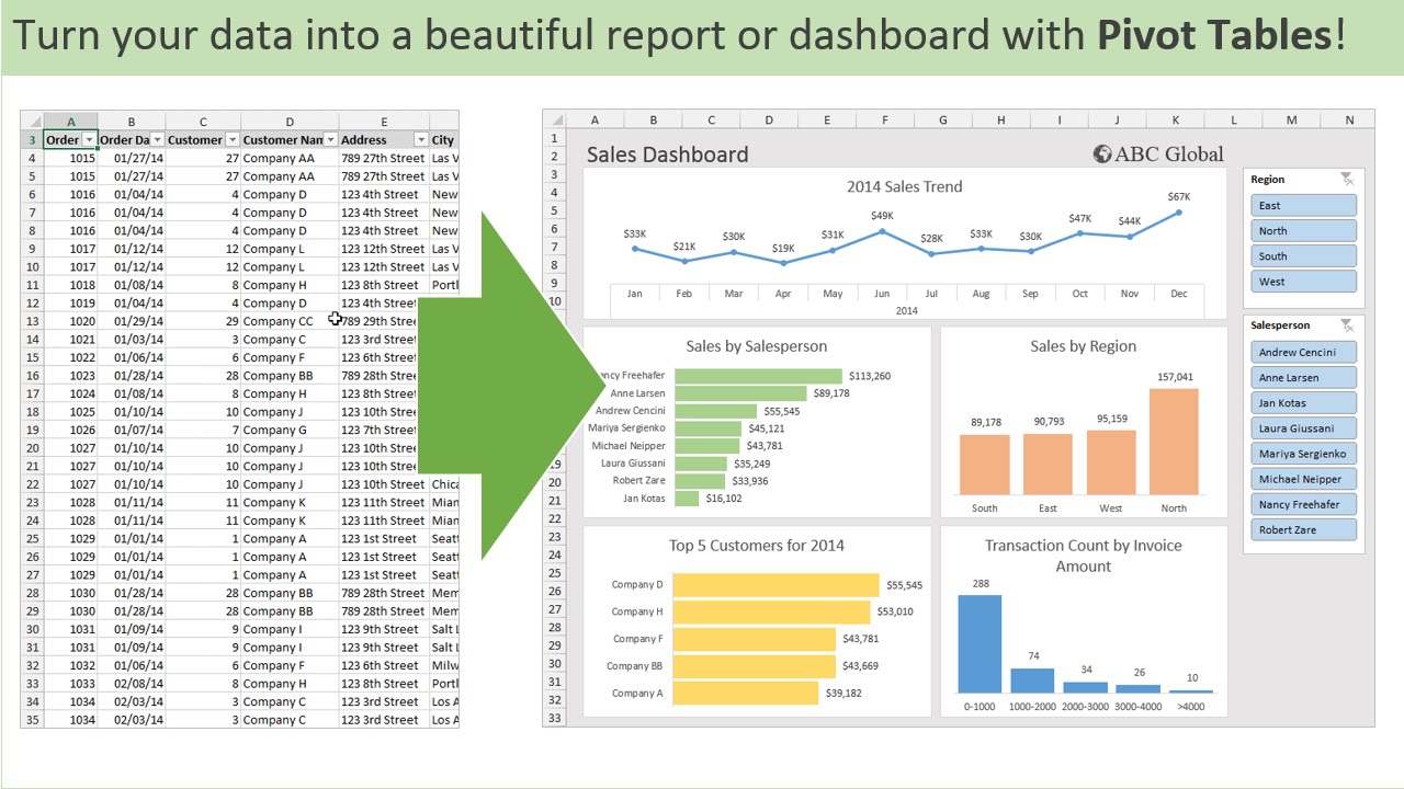
Open in Querivo →Build Professional Dashboards That Tell Your Business Story
Moving beyond single charts, this next tutorial, "Make an Awesome Excel Dashboard in Just 15 Minutes," focuses on creating comprehensive, professional dashboards. It’s all about transforming that mountain of raw data into a clean, centralized hub of key performance indicators (KPIs) and visual summaries. You’ll discover how to design a dashboard that isn't just pretty, but incredibly functional – guiding the viewer’s eye to the most important information. The creator demonstrates using a variety of chart types, showing you how to pick the right visual for different data relationships, which is a critical skill in Excel data visualization. Plus, you'll get hands-on with formulas and functions that keep your dashboard dynamically updated, meaning you won't be manually refreshing everything every time the numbers change. This video is surprisingly accessible, making complex dashboard creation feel achievable.
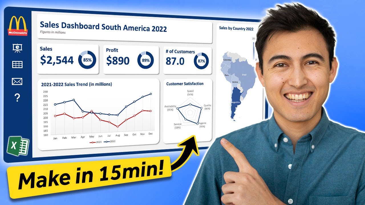
- Design effective dashboard layouts for clarity and impact.
- Implement dynamic formulas for real-time data updates.
Unlock Advanced Excel Charts for Deeper Analysis
Sometimes, standard charts just don't cut it. That's where "How to Build Excel Interactive Dashboards" comes in, specifically diving into powerful, yet often underutilized, chart types: Waterfall and Gantt charts. These aren't your everyday bar and line graphs. Waterfall charts, for instance, are brilliant for showing the cumulative effect of sequential positive and negative values – super handy for financial analysis to track profit changes or budget impacts. And Gantt charts? They're an absolute must for anyone involved in project management, offering a clear visual timeline of tasks, durations, and dependencies. This video shows you exactly how to construct them within Excel and, crucially, how to format them for a polished, professional look. Understanding when and how to use these advanced charts can really elevate your reporting, providing deeper insights into financial flows and project progress. It’s about using the right tool for the job, and these tools are definitely worth mastering.
- Master Waterfall charts for financial analysis.
- Build Gantt charts for effective project timeline visualization.
Automate Your Reporting with Dynamic Excel Dashboards
Imagine a reporting system that updates itself. That's the promise of the video, "How to create a Simple Dashboard Report in Microsoft Excel." This tutorial hones in on automating your reporting processes by building dynamic dashboards that can automatically pull in new data. It’s not just about pretty graphs; it’s about making your reports come alive with Key Performance Indicators (KPIs) that update in real-time, giving you immediate business insights. You’ll learn how to set up those all-important data connections so your dashboard stays current without you lifting a finger. Plus, the creator shows you how to create dynamic KPIs, often using conditional formatting and smart formulas, to highlight what matters most at a glance. This is crucial for staying ahead in fast-paced environments. And they share best practices for keeping these dynamic dashboards running smoothly over time. It’s a practical approach to making your reporting more efficient and impactful.
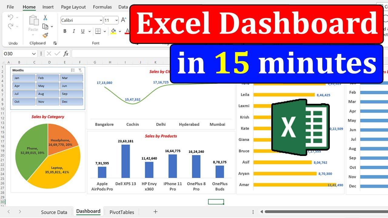
- Set up data connections for automated report updates.
- Design dashboards that highlight Key Performance Indicators (KPIs).
Your Next Steps
Mastering data visualization in Excel empowers you to transform complex data into clear, compelling, and actionable insights. By leveraging dynamic charts, interactive slicers, and professional dashboards, you can significantly improve your reporting and decision-making. Ready to create your own impactful reports? Start exploring these YouTube tutorials today and elevate your Excel skills!
Your Action Items
- ☐Pick one video from above and watch it on Querivo
- ☐Ask questions and check summaries while watching without breaking your flow
- ☐Use the AI chat to clarify confusing parts and deepen understanding
- ☐Come back for more curated videos on topics you want to master
Turn Any YouTube Video into an Interactive Lesson
Paste any video link, get an instant AI summary, and ask questions in real-time.
Try Querivo Free →Related Videos You Might Enjoy
Looking for more perspectives on this topic? Here are some additional videos worth checking out:
Learn 80% of Data Analysis in Excel in Just 12 Minutes

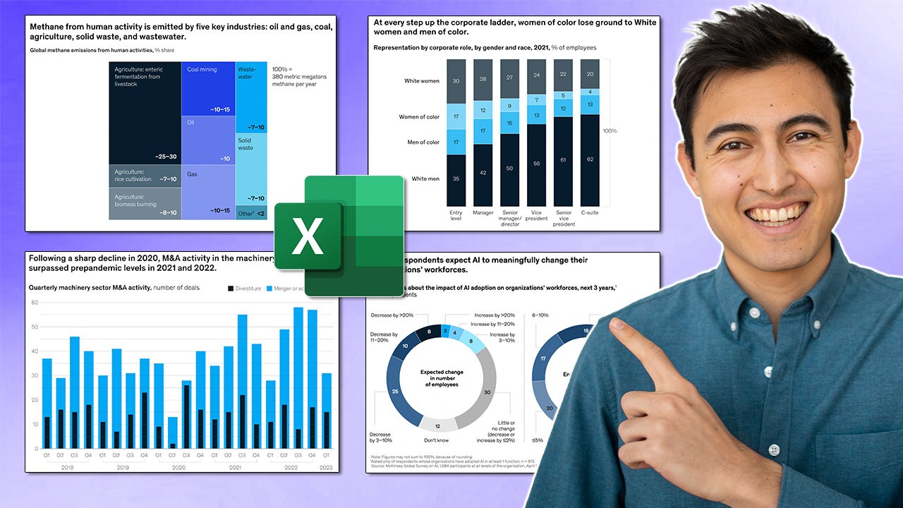
Make Impressive McKinsey Visuals in Excel!
Introduction to Pivot Tables, Charts, and Dashboards in Excel (Part 1)
Build Dynamic Pie Charts with Slicers for Powerful Data Visualization in Excel
This video provides a step-by-step guide on creating dynamic pie charts with slicer filtering in Microsoft Excel. It demonstrates how to use PivotTables and slicers to enable interactive data visualization, allowing users to filter and view specific regional data summaries.