In today's data-driven world, simply having information isn't enough. To truly influence decisions and drive understanding, you need to tell your data's story with clarity and impact. Excel, a ubiquitous tool for many, offers powerful capabilities for transforming raw numbers into compelling visual narratives.
Key Takeaways
- 1Master Excel data visualization with curated YouTube guides.
- 2Learn foundational concepts and essential chart types.
- 3Explore AI-assisted dashboard creation.
- 4Build impactful visuals for clearer communication.
- 5Drive better decision-making with compelling data stories.
Who this is for
- If you're struggling to make your data make sense to others
- If you're looking to create more engaging reports and presentations
- If you're an Excel user wanting to elevate your data storytelling skills
Start Learning with AI-Powered Video Summaries
Get instant summaries, ask questions, and turn any video into an interactive study session.
Try Querivo Free →Unlock Data's Potential: The Core of Effective Excel Visualization
Simply presenting numbers often falls flat. To make your data resonate, you need to visualize it. The video "Data Visualization in 2025 | The Ultimate Guide" by Visme demystifies data visualization, making it accessible to a broad audience. It explains why data visualization is so crucial in our fast-paced world, where attention is a precious commodity. You'll learn how to plan your visuals effectively, considering the relationships within your data, its frequency, and any inherent value or risk. This foundational understanding is key before you even think about specific chart types, ensuring your visuals are not just pretty charts, but tools for making complex information digestible and actionable.

- Understand the fundamental importance of data visualization for impact.
- Learn to plan your visuals by considering data relationships, frequency, and value.
- Discover how readily available tools can be leveraged for professional visuals.
Supercharge Your Dashboards with AI in Excel
Creating dynamic dashboards in Excel can be time-consuming, right? Well, the video "How I Built a ONE CLICK Excel Dashboard with ChatGPT 😎" by Website Learners explores a pretty game-changing approach: leveraging AI. Specifically, it shows how you can use tools like ChatGPT not just for code generation but also for conceptualization and design iteration, offering a 'one-click' approach to dashboard creation. Imagine speeding up your development process significantly! You'll discover how to convert data formats, like CSV to JSON, to interact effectively with AI. Plus, a really important aspect highlighted is maintaining data privacy – this method cleverly keeps the bulk of the data local, making complex dashboard creation accessible while prioritizing your sensitive information. It’s a modern way to build dashboards faster and smarter.
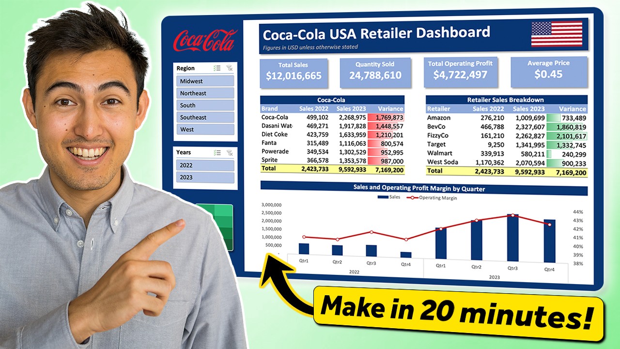
- Utilize AI (ChatGPT) for rapid dashboard idea generation and code creation.
- Streamline dashboard development while prioritizing data privacy with a 'one-click' method.
- Learn to convert data formats for effective AI interaction.
Study This Video Deeper
Get an AI summary and ask questions about confusing parts in real-time.
Open in Querivo →Choosing the Right Chart: Excel's Visual Storytelling Toolkit
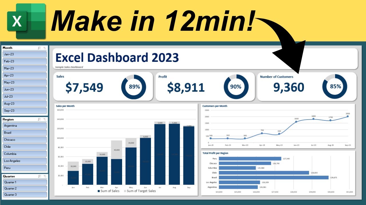
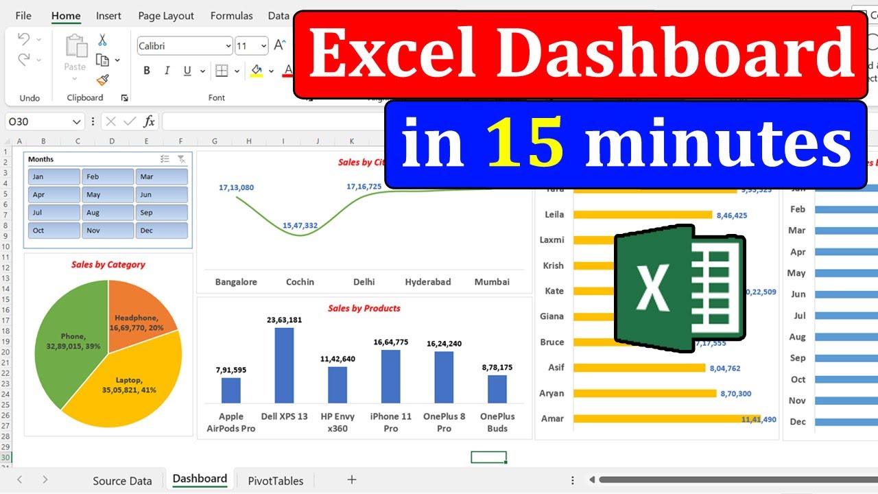
Picking the correct chart type is actually half the battle when it comes to clear Excel data visualization. The video "Make an Interactive Excel Dashboard in 4 Simple Steps!" by Kenji Explains is your practical guide to mastering essential Excel charts and building dashboards. You'll learn how to select the most appropriate chart for different data scenarios – whether you're comparing values, showing trends over time, or illustrating distribution. Plus, it’s packed with actionable tips on formatting and customizing your charts to ensure they're not just accurate but also incredibly clear. We all know how easy it is to create charts that confuse rather than inform; this video helps you avoid those common pitfalls and make your visualizations truly tell a coherent story.

- Select the ideal chart type for various data comparison, trend, and distribution needs.
- Apply best practices for formatting and customization to ensure clarity.
- Learn a simplified, step-by-step approach to building interactive dashboards.
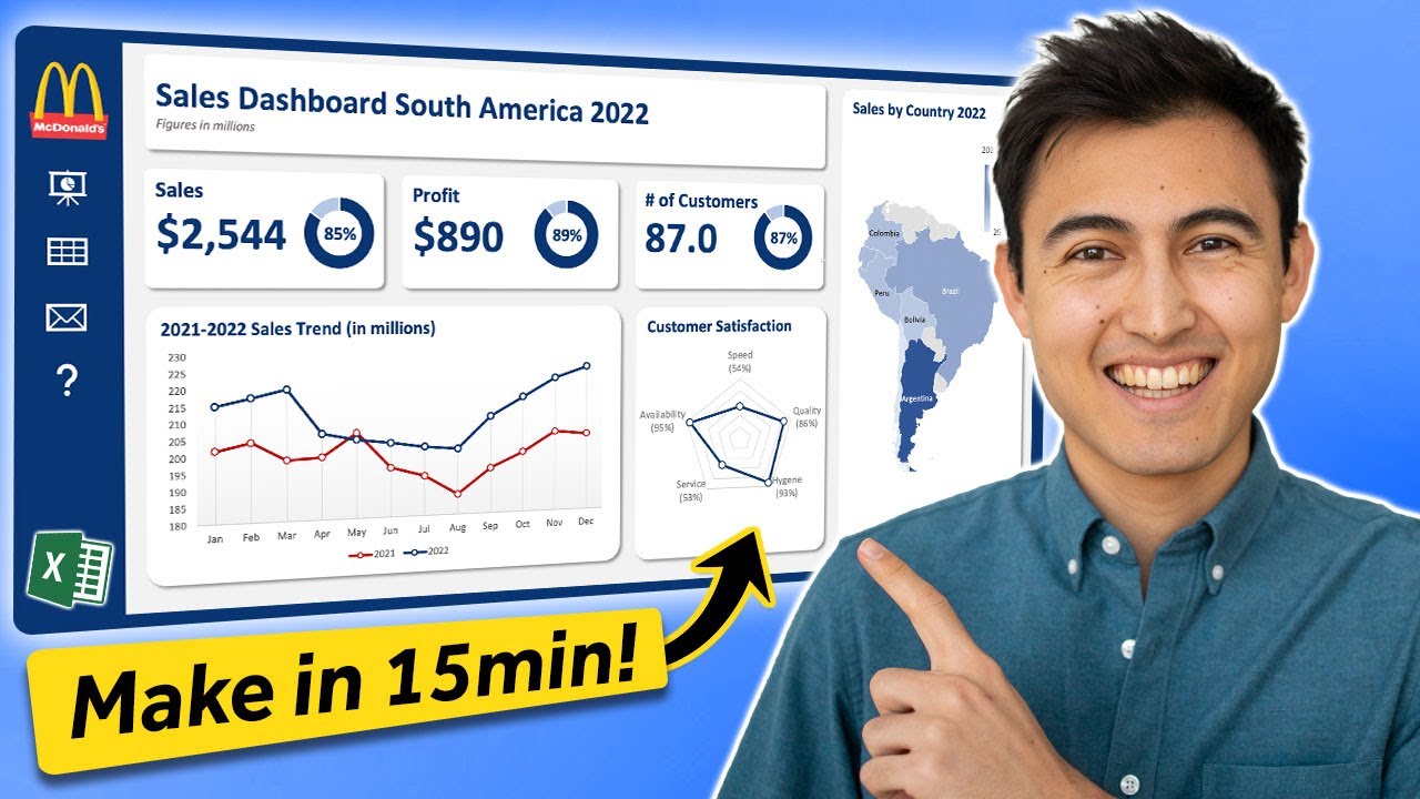
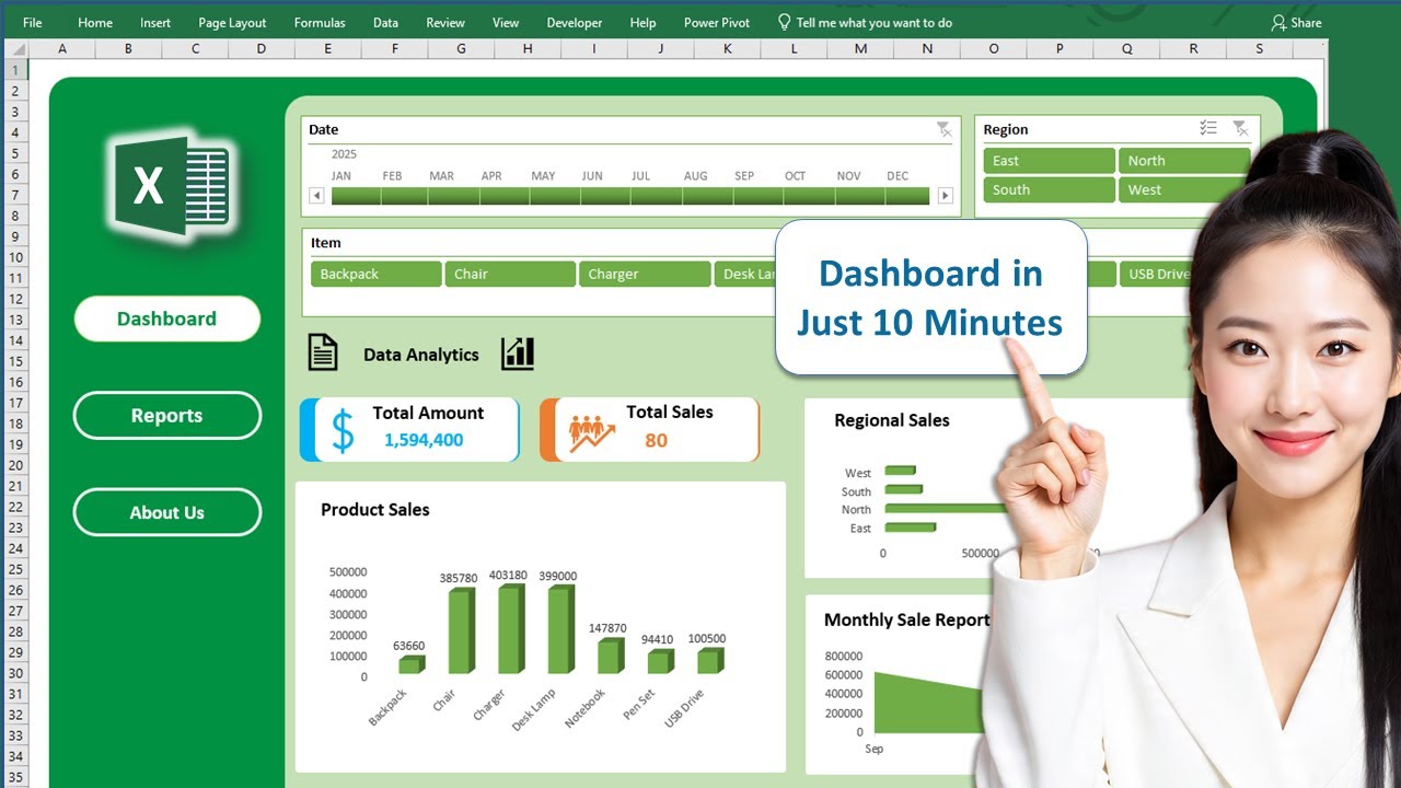
Design Like a Pro: Crafting Impactful Excel Dashboards
Ready to build dashboards that actually drive insights? The video "How to Build Excel Interactive Dashboards" by Kevin Stratvert offers a comprehensive walkthrough, focusing on the strategic design principles behind effective Excel dashboards. You'll learn how to structure your dashboard for optimal user experience, making it easier for anyone to grasp the key information at a glance. It covers creating interactive elements and visualizations that turn static numbers into dynamic narratives. If your goal is to create dashboards that lead to informed decision-making, this is definitely a must-watch. It breaks down the process into actionable steps, moving from concept to a polished, insightful end product, providing valuable content for building robust dashboards.
- Grasp the principles of effective dashboard design for clear data storytelling.
- Learn practical steps to build interactive and informative Excel dashboards.
- Understand how to create compelling visuals that drive insights.
Your Next Steps
Your Action Items
- ☐Pick one video from above and watch it on Querivo
- ☐Ask questions and check summaries while watching without breaking your flow
- ☐Use the AI chat to clarify confusing parts and deepen understanding
- ☐Come back for more curated videos on topics you want to master
By leveraging the power of Excel's visualization tools, guided by expert insights from these YouTube videos, you can transform your raw data into clear, impactful stories. From understanding the fundamentals of data visualization to building dynamic dashboards with AI assistance and mastering essential chart types, the path to effective Excel data visualization is now clearer than ever. These resources offer practical, actionable advice that can significantly elevate your reporting and presentation skills.
Turn Any YouTube Video into an Interactive Lesson
Paste any video link, get an instant AI summary, and ask questions in real-time.
Try Querivo Free →Related Videos You Might Enjoy
Looking for more perspectives on this topic? Here are some additional videos worth checking out: