Tired of static spreadsheets and cumbersome reports? Imagine transforming your raw data into dynamic, interactive dashboards that unlock powerful insights at a glance. This curated collection of YouTube video series will guide you through the process, empowering you to create professional, insightful, and interactive dashboards in Excel. Whether you're a beginner or looking to enhance your skills, these resources offer practical techniques and cutting-edge approaches to data visualization.
Key Takeaways
- 1Curated Excel dashboard tutorials for impactful insights.
- 2Master Pivot Tables, slicers, and conditional formatting.
- 3Learn rapid dashboard creation and AI-powered tools.
- 4Build dynamic reports for smarter business decisions.
- 5Unlock advanced data visualization techniques in Excel.
Who this is for
- If you're struggling to present data clearly and concisely
- If you're looking to make your Excel reports more interactive and engaging
- If you're a beginner to intermediate Excel user eager to create professional dashboards
Start Learning with AI-Powered Video Summaries
Get instant summaries, ask questions, and turn any video into an interactive study session.
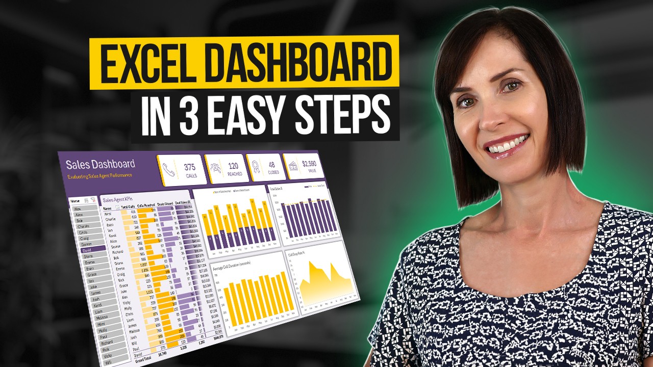
Try Querivo Free →Master the Art of Dynamic Excel Dashboards in 3 Simple Steps
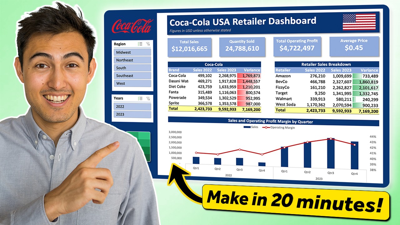
Ever felt overwhelmed by raw data, wishing for a clearer way to see the bigger picture? This video breaks down the process of building a truly interactive Excel dashboard into just three core steps, making it surprisingly manageable. We're talking about setting up your workspace for maximum clarity, using the powerhouse that is Pivot Tables for your data analysis, and then weaving in interactive elements so you can actually play with your data. You'll learn how to make your key metrics pop with conditional formatting, too. This resource provides valuable content for anyone who wants to move beyond basic spreadsheets and into dynamic reporting. By following this clear, three-step process, you can build a functional interactive dashboard, and the creator even offers a free downloadable template to help you get started.
- Structure your dashboard for clarity and impact.
- Use Pivot Tables and slicers for interactive data exploration.
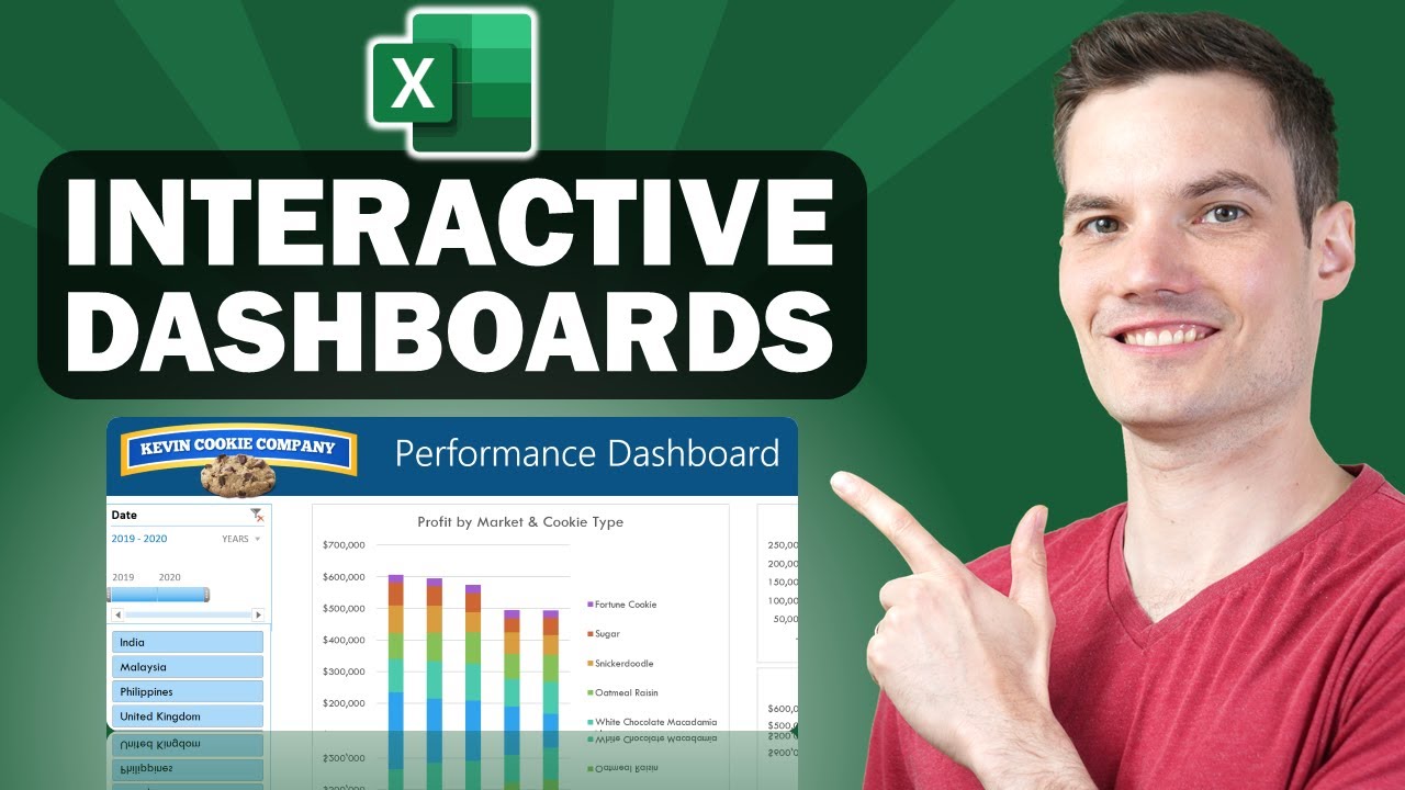
Build Visually Appealing & Dynamic Dashboards for Business Insights
This video really shines for those who are perhaps a little new to the dashboard game or are at an intermediate level and want to level up. It walks you through creating a structured and easy-to-read dashboard, which is, honestly, half the battle. You'll get hands-on with Pivot Tables to pull out those crucial insights from your raw numbers and learn how to define and visualize your Key Performance Indicators (KPIs) so they're not just numbers, but actual, actionable information. Plus, the way it uses slicers to make everything dynamic? That's a game-changer for user experience, letting anyone explore the data with a few clicks. It's a thorough, step-by-step approach that really helps cement the concepts, making it valuable content for building professional reports.
- Establish a clear structure for optimal readability.
- Enhance interactivity and user experience with dynamic slicers.
Study This Video Deeper
Get an AI summary and ask questions about confusing parts in real-time.
Open in Querivo →Rapidly Create Professional, Interactive Dashboards with Modern Excel
Here's one for those who need results, like, yesterday. This tutorial promises professional, interactive dashboards built at an impressive speed, often in under 10 minutes. How? By masterfully wielding Pivot Tables, Pivot Charts, and those super handy interactive elements like Timelines and Slicers. It’s a fantastic way to see just how powerful Excel can be when you combine its features effectively. Beyond just function, it also emphasizes design – applying formatting and layout principles that give your work that polished, professional look that really makes data digestible and impressive. This video breaks down the complex task of creating an interactive dashboard into four easily digestible steps, using a practical example and clear, concise instructions. The inclusion of visual cues like 'dashboard tracker' progress bars adds to engagement, making it a valuable resource for efficient dashboard creation.
- Create effective dashboards efficiently using Pivot Tables and Pivot Charts.
- Apply formatting and design for a polished, professional output.
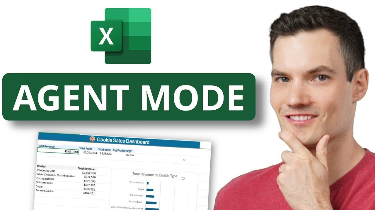
Harnessing AI for Effortless Dashboard Creation with Excel Agent Mode
Now, this is where things get really interesting. We're talking about leveraging the power of AI directly within Excel. This video dives into Excel's Agent Mode, a feature that can automatically generate interactive dashboards for you. Imagine just describing what you need, and Excel starts building it. It's a peek into the future of data analysis and reporting. You'll discover how to enable this AI-powered mode, craft those all-important natural language prompts to get the dashboard outputs you're looking for, and then refine what the AI creates. It also touches on the Excel Labs Add-in for even more advanced features. This is definitely for the forward-thinking user who wants to explore cutting-edge tools and unlock new possibilities in dashboard creation.
- Understand and enable Excel's AI-powered Agent Mode.
- Craft effective prompts to describe desired dashboard outputs.
Your Next Steps
By exploring these diverse YouTube video series, you've gained a comprehensive understanding of how to build dynamic and insightful dashboards in Excel. From foundational manual techniques like those explained in the three-step tutorial and the visually focused guide, to the rapid creation methods and the cutting-edge AI-powered automation, you're now equipped to transform your data into powerful visual tools for business intelligence.
Your Action Items
- ☐Pick one video from above and watch it on Querivo
- ☐Ask questions and check summaries while watching without breaking your flow
- ☐Use the AI chat to clarify confusing parts and deepen understanding
- ☐Come back for more curated videos on topics you want to master
Start building your first interactive Excel dashboard today! Experiment with the techniques from these videos and unlock the true potential of your data.
Turn Any YouTube Video into an Interactive Lesson
Paste any video link, get an instant AI summary, and ask questions in real-time.
Try Querivo Free →Related Videos You Might Enjoy
Looking for more perspectives on this topic? Here are some additional videos worth checking out:
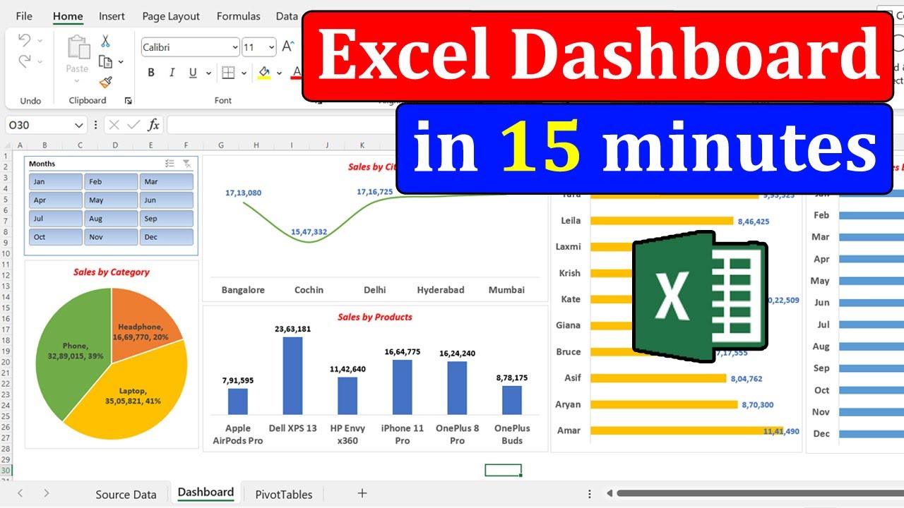
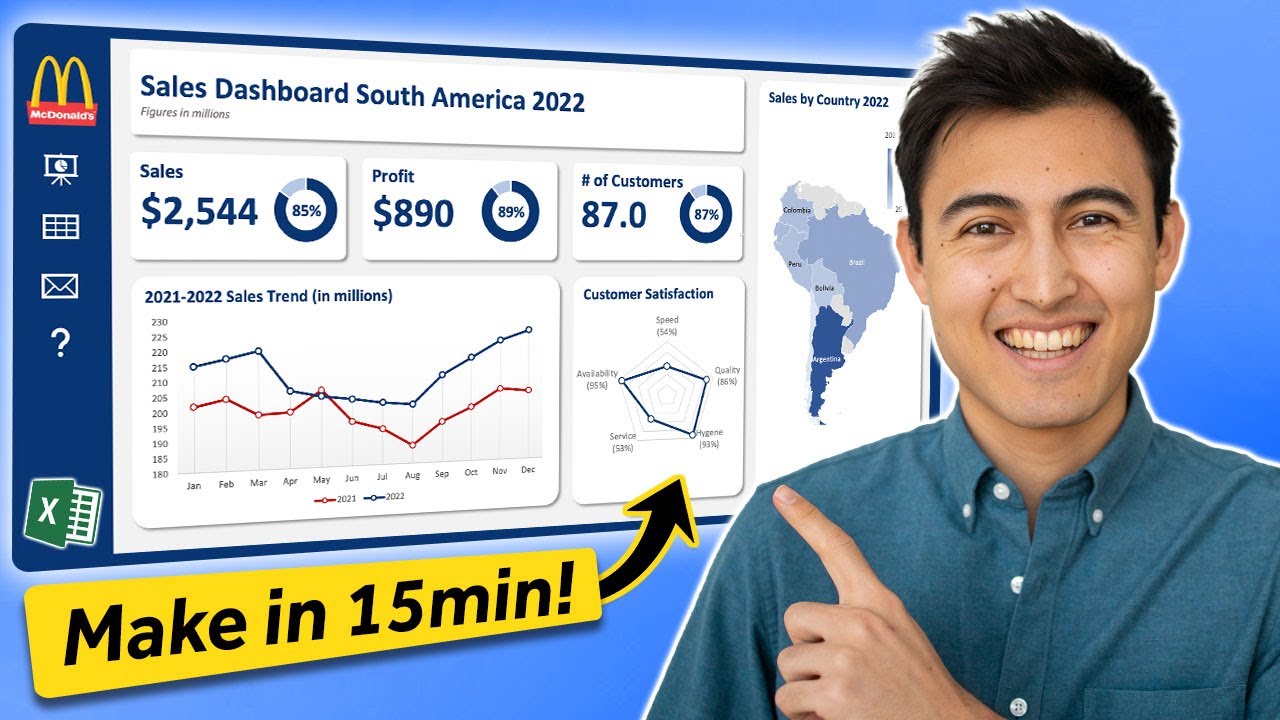
Make an Awesome Excel Dashboard in Just 15 Minutes
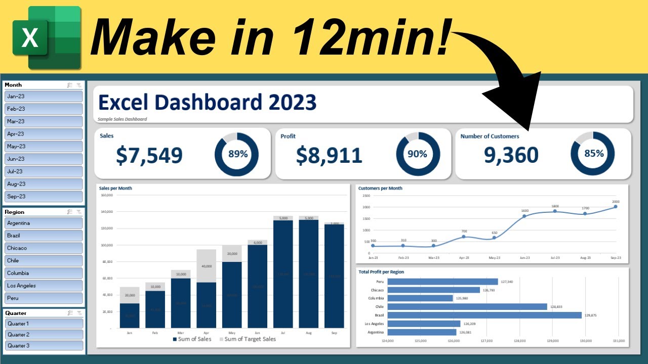
Make Interactive Excel Dashboard in Just 12 Minutes
This video tutorial demonstrates how to create an interactive Excel dashboard in just 12 minutes. It guides viewers through structuring the dashboard, adding key metrics, visualizing data with charts, and implementing slicers for interactive filtering.
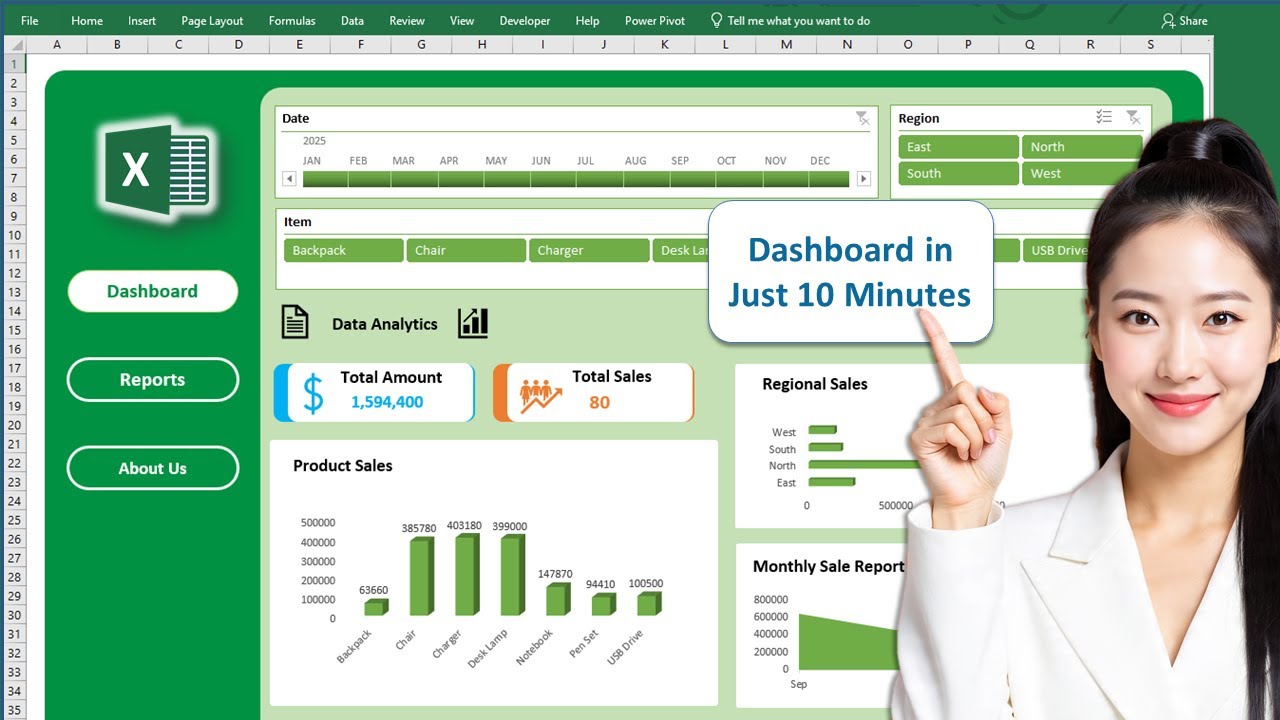
Create Professional Excel Dashboard in just 10 Minutes || Interactive & Dynamic #excel #dashboard
This video tutorial demonstrates how to create a professional and interactive Excel dashboard in under 10 minutes. It covers using Pivot Tables, Timelines, Slicers, charts, shapes, and icons to dynamically visualize and analyze data.
Excel Agent Mode: Build Dashboards Automatically (Step-by-Step Tutorial)
This video demonstrates how to use Excel's new Agent Mode, powered by AI, to automatically generate interactive dashboards from raw data by simply describing the desired output. It covers enabling the feature, creating a prompt, refining the dashboard, and making it interactive.